In a previous article, we played with CSS masks to create cool hover effects where the main challenge was to rely only on the <img> tag as our markup. In this article, pick up where we left off by “revealing” the image from behind a sliding door sort of thing — like opening up a box and finding a photograph in it.
See the Pen [Image gift box (hover to reveal)](https://codepen.io/smashingmag/pen/LYaPPPo) by Temani Afif.
Pretty neat, right? You might think this is an easy thing to pull off. All we really need is an overlay above the image that we translate, and, boom, we’re done, right?
That’s true. But if you check the code, you won’t find any additional elements in the markup other than the exact same <img> tag we used last time. Plus, we cannot even use pseudo-elements to make this work. This is what makes such an effect a bit more challenging.
Don’t look at the code right now. Let’s build it together by breaking the demo into isolated little CSS tricks.
The Image And Sliding Overlay
You would be correct in thinking it’s impossible to add an overlay to an image without an extra element. Instead, we are going to fake it and create the illusion of an overlay.
We have defined the width as a CSS variable (--s) and repurposed it to apply padding along the right side of the element. Combined with box-sizing: border-box, this will make the size of the content box equal to 0. In other words, we don’t see the image, but we see the background color since it covers the padding area.
On hover, let’s make the padding equal to 0:
See the Pen [Padding animation to reveal the image](https://codepen.io/smashingmag/pen/jOJrqXo) by Temani Afif.
Nothing surprising, right? By decreasing the padding, we increase the size of the content box and it slowly reveals the image. We’re basically squishing it vertically and allowing to widen back into place on hover.
Let’s add two more properties to the mix:
img {
  object-fit: cover;
  object-position: left;
}
See the Pen [Adding object-* properties](https://codepen.io/smashingmag/pen/oNVLLdM) by Temani Afif.
Tada! The effect looks much better now, and we have an overlay reveal animation even if, in reality, the overlay you see is the background, which is behind the image! The illusion is perfect.
Why does it behave like that? The logic is explained nicely over at MDN:
“The replaced content is sized to maintain its aspect ratio while filling the element’s entire content box. If the object’s aspect ratio does not match the aspect ratio of its box, then the object will be clipped to fit.”
In other words, the image will maintain its ratio while filling the content box. As a result, the image does not get distorted by the padding as we saw in the first demo — instead, it is clipped. Then, object-position: left aligns the position of the image to the left so it doesn’t move while the size of the content box increases as a result of the decreased padding on hover.
If we change the position to right, you get a different effect:
See the Pen [Using object-position: right](https://codepen.io/smashingmag/pen/xxBOOJW) by Temani Afif.
Instead of an overlay animation, we have a kind of sliding effect where the image enters from the left. This is directly related to another cool CSS trick that I used in a previous article to create a “pop-out” hover effect:
See the Pen [Fancy Pop Out Reveal hover effect!](https://codepen.io/smashingmag/pen/VwqWRyj) by Temani Afif.
You will notice that it’s pretty easy to switch between the different variations by toggling a couple of values in the CSS.
Sliding The Overlay Outside The Image
Now that we have our overlay, let’s try to slide it outside of the image. Instead of decreasing its size like we did previously, we want it to maintain its size and move it.
Cool, right? We have an overlay above our image that slides over to reveal the image — without using any extra elements in the markup or pseudo-elements in the styles!
We can do the same effect using a clip-path animation as well.
We define a box-shadow as having a widespread radius, but we won’t actually see it because it’s clipped. On hover, though, we update the inset() value to reveal the box-shadow on the right side of the image.
See the Pen [Using clip-path instead of box-shadow](https://codepen.io/smashingmag/pen/YzgWxxK) by Temani Afif.
Using the same technique, we can slide the overlay in whatever direction we want. Can you figure out how? Give it a shot by forking the Pen above and changing directions as an exercise before we move to the next part of our work.
Adding Borders
Borders can help create space around the image and get it close to a square box shape. Don’t forget that we want to create a 3D box in the end. But let’s see what happens when we add borders.
See the Pen [Adding border](https://codepen.io/smashingmag/pen/YzgWrvQ) by Temani Afif.
Hmm, not good. The border sits above the overlay, and the image isn’t a perfect square, at least initially. Even if that seems glitchy at first, it’s a logical outcome since the border is painted above the background, and its thickness adds up to the element’s total size.
What we need to do is adjust the padding to account for the border’s size. Then, let’s make the border transparent so that we can see the background color behind it.
First off, note that we’ve added the color-mix() function that allows us to define a new color variation from the original color value (--c:#8A9B0F) by mixing it with white to get a brighter shade. Then, we use that new color to create a gradient above the element’s background color, which is declared right after the gradient. The same color is also used for the box-shadow.
The idea is to decrease the size of the gradient the same way we do with the padding so that the background-color behind the gradient is revealed.
See the Pen [Adding gradient animation](https://codepen.io/smashingmag/pen/rNRLJpB) by Temani Afif.
That’s really nice! But did you catch the subtle visual issue? If you look closely, you can notice that the overlay is slightly out of alignment with the border.
This is because the padding has a transition that goes from s - 2*b to 0. Meanwhile, the background transitions from 100% (equivalent to --s) to 0. There’s a difference equal to 2*b. The background covers the entire area, while the padding covers less of it. We need to account for this.
Ideally, the padding transition would take less time to complete and have a small delay at the beginning to sync things up, but finding the correct timing won’t be an easy task. Instead, let’s increase the padding transition’s range to make it equal to the background.
The new variable, --h, transitions from s - b to -b on hover, so we have the needed range since the difference is equal to --s, making it equal to the background and clip-path transitions.
The trick is the min() function. When --h transitions from s - b to s - 2*b, the padding is equal to s - 2*b. No padding changes during that brief transition. Then, when --h reaches 0 and transitions from 0 to -b, the padding remains equal to 0 since, by default, it cannot be a negative value.
It would be more intuitive to use clamp() instead:
That said, we don’t need to specify the lower parameter since padding cannot be negative and will, by default, be clamped to 0 if you give it a negative value.
We are getting much closer to the final result!
See the Pen [Fixing the padding issue](https://codepen.io/smashingmag/pen/ExMgZbW) by Temani Afif.
Worth noting that we need to use @property to be able to apply a transition to the --h variable. The transition won’t work in Firefox at the time of this writing.
The 3D Effect
The last step is to add a touch of 3D to the effect. To better understand how we’re going to approach this, let’s temporarily remove the box-shadow, clip-path, and the linear-gradient() with the image in its revealed state.
See the Pen [The revealed image with border](https://codepen.io/smashingmag/pen/QWoKpyE) by Temani Afif.
Notice the semi-transparent black color values (e.g., #0008 and #0004). The slight bit of transparency blends with the colors behind it to create the illusion of a dark variation of the main color since the gradient is placed above the background color.
And lastly, we apply a clip-path to cut out the corners that establish the 3D box.
Let’s do the same thing with the linear gradient. We need to decrease its size so it covers the same area as it did before we introduced the depth so that it doesn’t overlap with the conic gradient:
See the Pen [Putting back the gradient animation](https://codepen.io/smashingmag/pen/VwRKpzN) by Temani Afif.
We are getting closer! The last piece we need to add back in from earlier is the clip-path transition that is combined with the box-shadow. We cannot reuse the same code we used before since we changed the clip-path value to create the 3D box shape. But we can still transition it to get the sliding result we want.
The idea is to have two points at the top that move up and down to reveal and hide the box-shadow while the other points remain fixed. Here is a small video to illustrate the movement of the points.
See that? We have five fixed points. The two at the top move to increase the area of the polygon and reveal the box shadow.
And we’re done! We’re left with a nice 3D frame around the image element with a cover that slides up and down on hover. And we did it with zero extra markup or reaching for pseudo-elements!
See the Pen [3D image with reveal effect](https://codepen.io/smashingmag/pen/GRejXMK) by Temani Afif.
This last demo is an optimized version of what we did together. I have written most of the formulas using the variable --h so that I only update one value on hover. It also includes another variation. Can you reverse-engineer it and see how its code differs from the one we did together?
One More 3D Example
Want another fancy effect that uses 3D effects and sliding overlays? Here’s one I put together using a different 3D perspective where the overlay splits open rather than sliding from one side to the other.
See the Pen [Image gift box II (hover to reveal)](https://codepen.io/smashingmag/pen/yLwBVGQ) by Temani Afif.
Your homework is to dissect the code. It may look complex, but if you trace the steps we completed for the original demo, I think you’ll find that it’s not a terribly different approach. The sliding effect still combines the padding, the object-* properties, and clip-path but with different values to produce this new effect.
Conclusion
I hope you enjoyed this little 3D image experiment and the fancy effect we applied to it. I know that adding an extra element (i.e., a parent <div> as a wrapper) to the markup would have made the effect a lot easier to achieve, as would pseudo-elements and translations. But we are here for the challenge and learning opportunity, right?
Limiting the HTML to only a single element allows us to push the limits of CSS to discover new techniques that can save us time and bytes, especially in those situations where you might not have direct access to modify HTML, like when you’re working in a CMS template. Don’t look at this as an over-complicated exercise. It’s an exercise that challenges us to leverage the power and flexibility of CSS.
When I was asked to make an auto-scrolling logo farm, I had to ask myself: “You mean, like a <marquee>?” It’s not the weirdest request, but the thought of a <marquee> conjures up the “old” web days when Geocities ruled. What was next, a repeating sparkling unicorn GIF background?
“Deprecated: This feature is no longer recommended. Though some browsers might still support it, it may have already been removed from the relevant web standards, may be in the process of being dropped, or may only be kept for compatibility purposes. Avoid using it, and update existing code if possible […] Be aware that this feature may cease to work at any time.”
That’s fine because whatever infinite scrolling feature <marquee> is offered, we can most certainly pull off in CSS. But when I researched examples to help guide me, I was surprised to find very little on it. Maybe auto-scrolling elements aren’t the rage these days. Perhaps the sheer nature of auto-scrolling behavior is enough of an accessibility red flag to scare us off.
Whatever the case, we have the tools to do this, and I wanted to share how I went about it. This is one of those things that can be done in lots of different ways, leveraging lots of different CSS features. Even though I am not going to exhaustively explore all of them, I think it’s neat to see someone else’s thought process, and that’s what you’re going to get from me in this article.
What We’re Making
But first, here’s an example of the finished result:
See the Pen [CSS only marquee without HTML duplication [forked]](https://codepen.io/smashingmag/pen/YzMQMXe) by Silvestar Bistrović.
The idea is fairly straightforward. We want some sort of container, and in it, we want a series of images that infinitely scroll without end. In other words, as the last image slides in, we want the first image in the series to directly follow it in an infinite loop.
So, here’s the plan: We’ll set up the HTML first, then pick at the container and make sure the images are correctly positioned in it before we move on to writing the CSS animation that pulls it all together.
Existing Examples
Like I mentioned, I tried searching for some ideas. While I didn’t find exactly what I was looking for, I did find a few demos that provided a spark of inspiration. What I really wanted was to use CSS only while not having to “clone” the marquee items.
Geoff Graham’s “Sliding Background Effect” is close to what I wanted. While it is dated, it did help me see how I could intentionally use overflow to allow images to “slide” out of the container and an animation that loops forever. It’s a background image, though, and relies on super-specific numeric values that make it tough to repurpose in other projects.
See the Pen [Untitled [forked]](https://codepen.io/smashingmag/pen/LYvLvGz) by @css-tricks.
The effect is what I’m after for sure, but it uses some JavaScript, and even though it’s just a light sprinkle, I would prefer to leave JavaScript out of the mix.
Ryan Mulligan’s “CSS Marquee Logo Wall” is the closest thing. Not only is it a logo farm with individual images, but it demonstrates how CSS masking can be used to hide the images as they slide in and out of the container. I was able to integrate that same idea into my work.
See the Pen [CSS Marquee Logo Wall [forked]](https://codepen.io/smashingmag/pen/ExJXJZm) by Ryan Mulligan.
But there’s still something else I’m after. What I would like is the smallest amount of HTML possible, namely markup that does not need to be duplicated to create the impression that there’s an unending number of images. In other words, we should be able to create an infinite-scrolling series of images where the images are the only child elements in the “marquee” container.
I did find a few more examples in other places, but these were enough to point me in the right direction. Follow along with me.
The HTML
Let’s set up the HTML structure first before anything else. Again, I want this to be as “simple” as possible, meaning very few elements with the shortest family tree possible. We can get by with nothing but the “marquee” container and the logo images in it.
This keeps things as “flat” as possible. There shouldn’t be anything else we need in here to make things work.
Setting Up The Container
Flexbox might be the simplest approach for establishing a row of images with a gap between them. We don’t even need to tell it to flow in a row direction because that’s the default.
.marquee {
  display: flex;
}
I already know that I plan on using absolute positioning on the image elements, so it makes sense to set relative positioning on the container to, you know, contain them. And since the images are in an absolute position, they have no reserved height or width dimensions that influence the size of the container. So, we’ll have to declare an explicit block-size (the logical equivalent to height). We also need a maximum width so we have a boundary for the images to slide in and out of view, so we’ll use max-inline-size (the logical equivalent to max-width):
Notice I’m using a couple of CSS variables in there: one that defines the marquee’s height based on the height of one of the images (--marquee-item-height) and one that defines the marquee’s maximum width (--marquee-max-width). We can give the marquee’s maximum width a value now, but we’ll need to formally register and assign a value to the image height, which we will do in a bit. I just like knowing what variables I am planning to work with as I go.
Next up, we want the images to be hidden when they are outside of the container. We’ll set the horizontal overflow accordingly:
And I really like the way Ryan Mulligan used a CSS mask. It creates the impression that images are fading in and out of view. So, let’s add that to the mix:
To push marquee images outside the container, we need to define a --marquee-item-offset, but that calculation is not trivial, so we will learn how to do it in the next section. We know what the animation needs to be: something that moves linearly for a certain duration after an initial delay, then goes on infinitely. Let’s plug that in with some variables as temporary placeholders.
.marquee__item {
  position: absolute;
  inset-inline-start: var(--marquee-item-offset);
  animation: go linear var(--marquee-duration) var(--marquee-delay, 0s) infinite;
}
To animate the marquee items infinitely, we have to define two CSS variables, one for the duration (--marquee-duration) and one for the delay (--marquee-delay). The duration can be any length you want, but the delay should be calculated, which is what we will figure out in the next section.
.marquee__item {
  position: absolute;
  inset-inline-start: var(--marquee-item-offset);
  animation: go linear var(--marquee-duration) var(--marquee-delay, 0s) infinite;
  transform: translateX(-50%);
}
Finally, we will translate the marquee item by -50% horizontally. This small “hack” handles situations when the image sizes are uneven.
See the Pen [CSS only marquee without HTML duplication, example 2 [forked]](https://codepen.io/smashingmag/pen/ExJXJMQ) by Silvestar Bistrović.
Note: I’m using the BEM modifier .marquee--8 to define the animation of the eight logos. We can define the animation keyframes now that we know the --marquee-item-width value.
@keyframes go {
  to {
    inset-inline-start: calc(var(--marquee-item-width) * -1);
  }
}
The animation moves the marquee item from right to left, allowing each one to enter into view from the right as it travels out of view over on the left edge and outside of the marquee container.
Now, we need to define the --marquee-item-offset. We want to push the marquee item all the way to the right side of the marquee container, opposite of the animation end state.
You might think the offset should be 100% + var(--marquee-item-width), but that would make the logos overlap on smaller screens. To prevent that, we need to know the minimum width of all logos combined. We do that in the following way:
But that is not enough. If the marquee container is too big, the logos would take less than the maximum space, and the offset would be within the container, which makes the logos visible inside the marquee container. To prevent that, we will use the max() function like the following:
The max() function checks which of the two values in its arguments is bigger, the overall width of all logos or the maximum width of the container plus the single logo width, which we defined earlier. The latter will be true on bigger screens and the former on smaller screens.
See the Pen [CSS only marquee without HTML duplication, example 3 [forked]](https://codepen.io/smashingmag/pen/BaEZEXN) by Silvestar Bistrović.
The delay equals the animation duration divided by a quadratic polynomial (that’s what ChatGPT tells me, at least). The quadratic polynomial is the following part, where we multiply the number of items and number of items minus the current item index:
Note that we are using a negative delay (* -1) to make the animation start in the “past,” so to speak. The only remaining variable to define is the --marquee-item-index (the current marquee item position):
This solution could be better, especially when the logos are not equal widths. To adjust the gaps between inconsistently sized images, we could calculate the delay of the animation more precisely. That is possible because the animation is linear. I’ve tried to find a formula, but I think it needs more fine-tuning, as you can see:
See the Pen [CSS only marquee without HTML duplication, example 4 [forked]](https://codepen.io/smashingmag/pen/NWmgVWN) by Silvestar Bistrović.
Another improvement we can get with a bit of fine-tuning is to prevent big gaps on wide screens. To do that, set the max-inline-size and declare margin-inline: auto on the .marquee container:
See the Pen [CSS only marquee without HTML duplication, example 5 [forked]](https://codepen.io/smashingmag/pen/qBwjGBJ) by Silvestar Bistrović.
What do you think? Is this something you can see yourself using on a project? Would you approach it differently? I am always happy when I land on something with a clean HTML structure and a pure CSS solution. You can see the final implementation on the Heyflow website.
Many modern websites give users the power to set a site-specific color scheme preference. A basic implementation is straightforward with JavaScript: listen for when a user changes a checkbox or clicks a button, toggle a class (or attribute) on the <body> element in response, and write the styles for that class to override design with a different color scheme.
CSS’s new :has() pseudo-class, supported by major browsers since December 2023, opens many doors for front-end developers. I’m especially excited about leveraging it to modify UI in response to user interaction without JavaScript. Where previously we have used JavaScript to toggle classes or attributes (or to set styles directly), we can now pair :has() selectors with HTML’s native interactive elements.
Supporting a color scheme preference, like “Dark Mode,” is a great use case. We can use a <select> element anywhere that toggles color schemes based on the selected <option> — no JavaScript needed, save for a sprinkle to save the user’s choice, which we’ll get to further in.
Respecting System Preferences
First, we’ll support a user’s system-wide color scheme preferences by adopting a “Light Mode”-first approach. In other words, we start with a light color scheme by default and swap it out for a dark color scheme for users who prefer it.
The prefers-color-scheme media feature detects the user’s system preference. Wrap “dark” styles in a prefers-color-scheme: dark media query.
Next, set the color-scheme property to match the preferred color scheme. Setting color-scheme: dark switches the browser into its built-in dark mode, which includes a black default background, white default text, “dark” styles for scrollbars, and other elements that are difficult to target with CSS, and more. I’m using CSS variables to hint that the value is dynamic — and because I like the browser developer tools experience — but plain color-scheme: light and color-scheme: dark would work fine.
:root {
  /* light styles here */
  color-scheme: var(--color-scheme, light);

  /* system preference is "dark" */
  @media (prefers-color-scheme: dark) {
    --color-scheme: dark;
    /* any additional dark styles here */
  }
}
Giving Users Control
Now, to support overriding the system preference, let users choose between light (default) and dark color schemes at the page level.
HTML has native elements for handling user interactions. Using one of those controls, rather than, say, a <div> nest, improves the chances that assistive tech users will have a good experience. I’ll use a <select> menu with options for “system,” “light,” and “dark.” A group of <input type="radio"> would work, too, if you wanted the options right on the surface instead of a dropdown menu.
Before CSS gained :has(), responding to the user’s selected <option> required JavaScript, for example, setting an event listener on the <select> to toggle a class or attribute on <html> or <body>.
But now that we have :has(), we can now do this with CSS alone! You’ll save spending any of your performance budget on a dark mode script, plus the control will work even for users who have disabled JavaScript. And any “no-JS” folks on the project will be satisfied.
What we need is a selector that applies to the page when it :has() a select menu with a particular [value]:checked. Let’s translate that into CSS:
:root:has(select option[value="dark"]:checked)
We’re defaulting to a light color scheme, so it’s enough to account for two possible dark color scheme scenarios:
The page-level color preference is “system,” and the system-level preference is “dark.”
The page-level color preference is “dark”.
The first one is a page-preference-aware iteration of our prefers-color-scheme: dark case. A “dark” system-level preference is no longer enough to warrant dark styles; we need a “dark” system-level preference and a “follow the system-level preference” at the page-level preference. We’ll wrap the prefers-color-scheme media query dark scheme styles with the :has() selector we just wrote:
:root {
  /* light styles here */
  color-scheme: var(--color-scheme, light);

  /* page preference is "system", and system preference is "dark" */
  @media (prefers-color-scheme: dark) {
    &:has(#color-scheme option[value="system"]:checked) {
      --color-scheme: dark;
      /* any additional dark styles, again */
    }
  }
}
Notice that I’m using CSS Nesting in that last snippet. Baseline 2023 has it pegged as “Newly available across major browsers” which means support is good, but at the time of writing, support on Android browsers not included in Baseline’s core browser set is limited. You can get the same result without nesting.
:root {
  /* light styles */
  color-scheme: var(--color-scheme, light);

  /* page preference is "dark" */
  &:has(#color-scheme option[value="dark"]:checked) {
    --color-scheme: dark;
    /* any additional dark styles */
  }
}
For the second dark mode scenario, we’ll use nearly the exact same :has() selector as we did for the first scenario, this time checking whether the “dark” option — rather than the “system” option — is selected:
:root {
  /* light styles */
  color-scheme: var(--color-scheme, light);

  /* page preference is "dark" */
  &:has(#color-scheme option[value="dark"]:checked) {
    --color-scheme: dark;
    /* any additional dark styles */
  }

  /* page preference is "system", and system preference is "dark" */
  @media (prefers-color-scheme: dark) {
    &:has(#color-scheme option[value="system"]:checked) {
      --color-scheme: dark;
      /* any additional dark styles, again */
    }
  }
}
Now the page’s styles respond to both changes in users’ system settings and user interaction with the page’s color preference UI — all with CSS!
But the colors change instantly. Let’s smooth the transition.
Respecting Motion Preferences
Instantaneous style changes can feel inelegant in some cases, and this is one of them. So, let’s apply a CSS transition on the :root to “ease” the switch between color schemes. (Transition styles at the :root will cascade down to the rest of the page, which may necessitate adding transition: none or other transition overrides.)
Note that the CSS color-scheme property does not support transitions.
:root {
  transition-duration: 200ms;
  transition-property: /* properties changed by your light/dark styles */;
}
Not all users will consider the addition of a transition a welcome improvement. Querying the prefers-reduced-motion media feature allows us to account for a user’s motion preferences. If the value is set to reduce, then we remove the transition-duration to eliminate unwanted motion.
:root {
  transition-duration: 200ms;
  transition-property: /* properties changed by your light/dark styles */;

  @media screen and (prefers-reduced-motion: reduce) {
    transition-duration: none;
  }
}
Transitions can also produce poor user experiences on devices that render changes slowly, for example, ones with e-ink screens. We can extend our “no motion condition” media query to account for that with the update media feature. If its value is slow, then we remove the transition-duration.
:root {
  transition-duration: 200ms;
  transition-property: /* properties changed by your light/dark styles */;

  @media screen and (prefers-reduced-motion: reduce), (update: slow) {
    transition-duration: 0s;
  }
}
Let’s try out what we have so far in the following demo. Notice that, to work around color-scheme’s lack of transition support, I’ve explicitly styled the properties that should transition during theme changes.
See the Pen [CSS-only theme switcher (requires :has()) [forked]](https://codepen.io/smashingmag/pen/YzMVQja) by Henry.
Not bad! But what happens if the user refreshes the pages or navigates to another page? The reload effectively wipes out the user’s form selection, forcing the user to re-make the selection. That may be acceptable in some contexts, but it’s likely to go against user expectations. Let’s bring in JavaScript for a touch of progressive enhancement in the form of…
Persistence
Here’s a vanilla JavaScript implementation. It’s a naive starting point — the functions and variables aren’t encapsulated but are instead properties on window. You’ll want to adapt this in a way that fits your site’s conventions, framework, library, and so on.
When the user changes the color scheme from the <select> menu, we’ll store the selected <option> value in a new localStorage item called "preferredColorScheme". On subsequent page loads, we’ll check localStorage for the "preferredColorScheme" item. If it exists, and if its value corresponds to one of the form control options, we restore the user’s preference by programmatically updating the menu selection.
/*
 * If a color scheme preference was previously stored,
 * select the corresponding option in the color scheme preference UI
 * unless it is already selected.
 */
function restoreColorSchemePreference() {
  const colorScheme = localStorage.getItem(colorSchemeStorageItemName);

  if (!colorScheme) {
    // There is no stored preference to restore
    return;
  }

  const option = colorSchemeSelectorEl.querySelector(`[value=${colorScheme}]`);

  if (!option) {
    // The stored preference has no corresponding option in the UI.
    localStorage.removeItem(colorSchemeStorageItemName);
    return;
  }

  if (option.selected) {
    // The stored preference's corresponding menu option is already selected
    return;
  }

  option.selected = true;
}

/*
 * Store an event target's value in localStorage under colorSchemeStorageItemName
 */
function storeColorSchemePreference({ target }) {
  const colorScheme = target.querySelector(":checked").value;
  localStorage.setItem(colorSchemeStorageItemName, colorScheme);
}

// The name under which the user's color scheme preference will be stored.
const colorSchemeStorageItemName = "preferredColorScheme";

// The color scheme preference front-end UI.
const colorSchemeSelectorEl = document.querySelector("#color-scheme");

if (colorSchemeSelectorEl) {
  restoreColorSchemePreference();

  // When the user changes their color scheme preference via the UI,
  // store the new preference.
  colorSchemeSelectorEl.addEventListener("input", storeColorSchemePreference);
}
Let’s try that out. Open this demo (perhaps in a new window), use the menu to change the color scheme, and then refresh the page to see your preference persist:
See the Pen [CSS-only theme switcher (requires :has()) with JS persistence [forked]](https://codepen.io/smashingmag/pen/GRLmEXX) by Henry.
If your system color scheme preference is “light” and you set the demo’s color scheme to “dark,” you may get the light mode styles for a moment immediately after reloading the page before the dark mode styles kick in. That’s because CodePen loads its own JavaScript before the demo’s scripts. That is out of my control, but you can take care to improve this persistence on your projects.
Persistence Performance Considerations
Where things can get tricky is restoring the user’s preference immediately after the page loads. If the color scheme preference in localStorage is different from the user’s system-level color scheme preference, it’s possible the user will see the system preference color scheme before the page-level preference is restored. (Users who have selected the “System” option will never get that flash; neither will those whose system settings match their selected option in the form control.)
If your implementation is showing a “flash of inaccurate color theme”, where is the problem happening? Generally speaking, the earlier the scripts appear on the page, the lower the risk. The “best option” for you will depend on your specific stack, of course.
What About Browsers That Don’t Support :has()?
All major browsers support :has() today Lean into modern platforms if you can. But if you do need to consider legacy browsers, like Internet Explorer, there are two directions you can go: either hide or remove the color scheme picker for those browsers or make heavier use of JavaScript.
If you consider color scheme support itself a progressive enhancement, you can entirely hide the selection UI in browsers that don’t support :has():
@supports not selector(:has(body)) {
  @media (prefers-color-scheme: dark) {
    :root {
      /* dark styles here */
    }
  }

  #color-scheme {
    display: none;
  }
}
Otherwise, you’ll need to rely on a JavaScript solution not only for persistence but for the core functionality. Go back to that traditional event listener toggling a class or attribute.
The CSS-Tricks “Complete Guide to Dark Mode” details several alternative approaches that you might consider as well when working on the legacy side of things.
I hope you were able to spend time getting familiar with the techniques we used to create tooltips in Part 1 of this quick two-parter. Together, we were able to create a flexible tooltip pattern that supports different directions, positioning, and coloration without adding any complexity whatsoever to the HTML.
We leveraged the CSS border-image property based on another article I wrote while applying clever clip-path tricks to control the tooltip’s tail. If you haven’t checked out that article or the first part of this series, please do because we’re jumping straight into things today, and the context will be helpful.
So far, we’ve looked at tooltip shapes with triangular tails with the option to have rounded corners and gradient coloration. Sure, we were able to do lots of things but there are many other — and more interesting — shapes we can accomplish. That’s what we’re doing in this article. We will handle cases where a tooltip may have a border and different tail shapes, still with the least amount of markup and most amount of flexibility.
Before we start, I want to remind you that I’ve created a big collection of 100 tooltip shapes. I said in Part 1 that we would accomplish all of them in these two articles. We covered about half of them in Part 1, so let’s wrap things up here in Part 2.
The HTML
Same as before!
<div class="tooltip">Your text content goes here</div>
That’s the beauty of what we’re making: We can create many, many different tooltips out of the same single HTML element without changing a thing.
Tooltips With Borders
Adding a border to the tooltips we made in Part 1 is tricky. We need the border to wrap around both the main element and the tail in a continuous fashion so that the combined shape is seamless. Let’s start with the first simple shape we created in Part 1 using only two CSS properties:
The border property is not an option here as far as adding borders to our tooltip. It won’t work. Instead, we need to use a pseudo-element that effectively traces the shape of the main element, then makes it smaller.
I’d say this looks great at first glance. But things get funky once we start adjusting the tail position. This is because the two clip-path shapes are not aligned since the pseudo-element is covering a smaller area than the main element. We need to keep the left and right values equal to 0 in order to fix this:
inset: 8px 0;
And let’s adjust the border-image to decrease the size of the colored area from the sides:
border-image: fill 0 / 0 8px / var(--h) 0
  conic-gradient(#CC333F 0 0); /* background color  */
Yes, it’s the border-image trickery from before! So, If you haven’t already, please read my article about border-image to see how we arrived here.
Now things are looking very good:
See the Pen [Fixing the clip-path alignment](https://codepen.io/smashingmag/pen/mdoLGEx) by Temani Afif.
The two clip-path shapes are nicely aligned. The tooltip is almost perfect. I say “almost” because there is a small issue with the border’s thickness. The thickness around the tail shape is a little smaller than the one around the element. If you play with the tail dimensions, you’ll see the inconsistency.
This probably is not that a big deal in most cases. A few pixels aren’t a glaring visual issue, but you can decide whether or not it meets your needs. Me? I’m a perfectionist, so let’s try to fix this minor detail even if the code will get a little more complex.
We need to do some math that requires trigonometric functions. Specifically, we need to change some of the variables because we cannot get what we want with the current setup. Instead of using the base variable for the tail’s dimensions, I will consider an angle. The second variable that controls the height will remain unchanged.
Nothing drastic has changed. We introduced a new variable to control the border thickness (--t) and updated the clip-path property with the new variables that define the tail’s dimensions.
Now, all the work will be done on the pseudo-element’s clip-path property. It will no longer inherit the main element’s value, but it does need a new value to get the correct border thickness around the tail. I want to avoid getting deep into the complex math behind all of this, so here is the implementation:
It looks complex because it is! You don’t really need to understand the formulas since all you have to do is adjust a few variables to control everything.
Now, finally, our tooltip is perfect. Here is an interactive demo where you can adjust the position and the thickness. Don’t forget to also play with the dimension of the tail as well.
See the Pen [Tooltip with border and solid color](https://codepen.io/smashingmag/pen/zYbjeop) by Temani Afif.
We learned in Part 1 that working with gradients using this approach is pretty great because we’re already supplying a gradient on the border-image property. All we need to do is fill the main element and tail with a real gradient instead of a solid color.
Let’s move on to the rounded corners. We can simply use the code we created in the previous article. We duplicate the shape using a pseudo-element and make a few adjustments for perfect alignment and a correct border thickness.
The reason I’m not going into details for this one is to make the point that you don’t have to remember all the various use cases and code snippets by heart. The goal is to understand the actual concepts we are using to build the tooltips, like working with border-image, clip-path(), gradients, and math functions.
I can’t even remember most of the code I write after it’s done, but it’s no issue since all I have to do is copy and paste then adjust a few variables to get the shape I want. That’s the benefit of leveraging modern CSS features — they handle a lot of the work for us.
Border-Only Tooltips
I’d like to do one more exercise with you, this time making a tooltip with no fill but still with a full border around the entire shape. So far, we’ve been able to reuse a lot of the code we put together in Part 1, but we’re going to need new tricks to pull this one off.
The goal is to establish a transparent background while maintaining the border. We’ll start without rounded corners for the moment.
See how we’re going to be working with gradients again? I could have used a single color to produce a solid, single-color border, but I put a hard stop in there to demonstrate the idea. We’ll be able to create even more variations, thanks to this little detail, like using multiple colors, different color stops, and even different types of gradients.
You’ll see that the code looks fairly straightforward:
We’re using pseudo element again, this time with a clip-path to establish the shape. From there, we set a linear-gradient() on the background.
I said the code “looks” very straightforward. Structurally, yes. But I purposely put a placeholder clip-path value because that’s the complicated part. We needed to use a 16-point polygon and math formulas, which honestly gave me big headaches.
That’s why I turn to my online generator in most cases. After all, what’s the point of everyone spending hours trying to suss out which formulas to use if math isn’t your thing? May as well use the tools that are available to you! But note how much better it feels to use those tools when you understand the concepts that are working under the hood.
For this one, we are going to rely on not one, but two pseudo-elements, :before and :after. One will create the rounded shape, and the other will serve as the tail.
The above figure illustrates the process for creating the rounded part with the :before pseudo-element. We first start with a simple rectangular shape that’s filled with a conic gradient containing three colors. Then, we mask the shape so that the inner area is transparent. After that, we use a clip-path to cut out a small part of the bottom edge to reserve space for the tail we’ll make with the :after pseudo-element.
Once again, the structure is not all that complex and the clip-path value is the tough part. As I said earlier, there’s really no need to get deep into an explanation on it when we can use the points from an online generator to get the exact shape we want.
The new piece that is introduced in this code is the mask property. It uses the same technique we covered in yet another Smashing article I wrote. Please read that for the full context of how mask and mask-composite work together to trim the transparent area. That’s the first part of your homework after finishing this article.
Fun Tail Shapes
We’ve covered pretty much every single one of the tooltips available in my collection. The only ones we have not specifically touched use a variety of different shapes for the tooltip’s tail.
All of the tooltips we created in this series used a simple triangle-shaped tail, which is a standard tooltip pattern. Sure, we learned how to change its dimensions and position, but what if we want a different sort of tooltip? Maybe we want something fancier or something that looks more like a speech or thought bubble.
If the rounded corners in the last section are the first part of your homework, then the next part is to try making these tail variations yourself using what we have learned together in these two articles. You can always find the code over at my collection for reference and hints. And, leave a comment here if you have any additional questions — I’m happy to help!
Conclusion
I hope you enjoyed this little series because I sure had a blast writing it. I mean, look at all of the things we accomplished in a relatively short amount of space: simple rectangular tooltips, rounded corners, different tail positions, solid and gradient backgrounds, a bunch of border options, and finally, custom shapes for the tail.
I probably went too far with how many types of tooltips we could make — there are 100 in total when you count them up! But it goes to show just how many possibilities there are, even when we’re always using the same single element in the HTML.
And, it’s great practice to consider all of the different use cases and situations you may run into when you need a tooltip component. Keep these in your back pocket for when you need them, and use my collection as a reference, for inspiration, or as a starting point for your own work!
In a previous article, we explored ribbon shapes and different ways to approach them using clever combinations of CSS gradients and clip-path(). This time, I’d like to explore another shape, one that you’ve likely had to tackle at least once in your front-end life: tooltips. You know what we’re talking about, those little things that look like speech bubbles from comic books. They’re everywhere in the wild, from a hover effect for buttons to the text messaging app on your phone.
The shapes may look easy to make in CSS at first glance, but it always ends with a lot of struggles. For example, how do you adjust the position of the tail to indicate whether the tooltip is coming from a left, right, or center position? There are plenty of considerations to take into account when making tooltips — including overflowage, collision detection, and semantics — but it’s the shape and direction of the tail that I want to focus on because I often see inflexible fixed units used to position them.
Forget what you already know about tooltips because in this article, we will start from zero, and you will learn how to build a tooltip with minimal markup powered by modern CSS that provides flexibility to configure the component by adjusting CSS variables. We are not going to build one or two shapes, but… 100 different shapes!
That may sound like we’re getting into a super-long article, but actually, we can easily get there by adjusting a few values. In the end, you will have a back pocket full of CSS tricks that can be combined to create any shape you want.
And guess what? I’ve already created an online collection of 100 different tooltip shapes where you can easily copy and paste the code for your own use, but stay with me. You’re going to want to know the secret to unlocking hundreds of possibilities with the least possible code.
We’ll start with the shapes themselves, discussing how we can cut out the bubble and tail by combining CSS gradients and clipping. Then, we’ll pick things back up in a second article dedicated to improving another common approach to tooltips using borders and custom shapes.
The HTML
We’re only working with a single element:
<div class="tooltip">Your text content goes here</div>
That’s the challenge: Create hundreds of tooltip variations in CSS with only a single element to hook into in the HTML.
A Simple Tooltip Tail
I’m going to skip right over the basic rectangular shape; you know how to set a width and height (or aspect-ratio) on elements. Let’s start with the simplest shape for the tooltip’s tail, one that can be accomplished with only two CSS properties:
The border-image property creates an “overflowing color” while clip-path defines the shape of the tooltip with polygon() coordinates. (Speaking of border-image, I wrote a deep-dive on it and explain how it might be the only CSS property that supports double slashes in the syntax!)
The tooltip’s tail is placed at the bottom center, and we have two variables to control its dimensions:
While these approaches are indeed easier, they require an extra declaration compared to the single border-image declaration we used. Plus, we’ll see later that border-image is really useful for accomplishing more complex shapes.
Here is a demo with the different directions so you can see how easy it is to adjust the above code to change the tail’s position.
See the Pen [A simple Tooltip using 2 CSS properties](https://codepen.io/smashingmag/pen/ExrEXoO) by Temani Afif.
Next, we’re going to study shapes that include the tail at the bottom, but you can easily find the other variations in my online collection.
Adjusting The Tail Position
Let’s add a third variable, --p, that we can use to control the tooltip’s tail position. In the last example, we used 50% in the clip-path, which positions the tail directly in the horizontal center along the bottom of the tooltip’s rectangular shape. If we assign a variable to it, we can easily change the direction of the tooltip to face left or right by updating 50% to a smaller or larger value, respectively.
The --p variable can go from 0% to 100%, where 0% is aligned with the left side of the tooltip and 100% is aligned with the right side. Here is an interactive demo where you can update the variable using a range slider:
See the Pen [Updating the tail position](https://codepen.io/smashingmag/pen/mdoLOGJ) by Temani Afif.
Nice, right?! It’s definitely cool, but there’s a glitch. When the tail’s position is set to the extremes, it appears to slide right off the edge of the bubble. Go ahead and toggle the range slider in the demo between 0% and 100% to see the issue.
The tooltip’s tail is allowed to overflow its container at the extremes. (Large preview)
We can fix this by setting limits to some values so the tail never falls outside the container. Two points of the polygon are concerned with the fix.
This:
calc(var(--p) + var(--b) / 2) 100%
…and this:
calc(var(--p) - var(--b) / 2) 100%
The first calc() needs to be clamped to 100% to avoid the overflow from the right side, and the second one needs to be clamped to 0% to avoid the overflow from the left side. We can use the min() and max() functions to establish the range limits:
The --x variable can be either positive or negative (using whatever unit you want, including percentages). What we’re doing is adding the variable that establishes the tail’s shape, --x, to the tail’s position, --p. In other words, we’ve updated this:
The tooltip’s tail points in either the right or left direction, depending on whether --x is a positive or negative value. Go ahead and use the range sliders in the following demo to see how the tooltip’s tail is re-positioned (--p) and re-shaped (--x) when adjusting two variables.
See the Pen [Updating the tail shape](https://codepen.io/smashingmag/pen/ExMLZZB) by Temani Afif.
Cool, right? If you’ve ever attempted tooltips on your own, I’m sure you will appreciate the way this approach eliminates the need to use magic numbers to tweak the tooltip’s appearance. That’s one significant headache we no longer have to worry about!
And did you notice how the tail, when stretched, is allowed to overflow the container? That’s perfect! Using min() and max(), we’re correctly fixing the overflow issue while allowing the tail to stretch further away from the container.
Note that I have updated the border-image outset to an impractically large value (9999px) instead of using the --h variable. The shape of the tail can be any type of triangle and can take a bigger area. Since there’s no way for us to know the exact value of the outset, we use that big value to make sure we have enough room to fill the tail in with color, no matter its shape.
Does the outset concept look strange to you? I know that working with border-image isn’t something many of us do all that often, so if this approach is tough to wrap your head around, definitely go check out my border-image article for a thorough demonstration of how it works.
Working With Gradients
Most of the trouble starts when we want to color the tooltip with a gradient instead of a flat color. Applying one color is simple — even with older techniques — but when it comes to gradients, it’s not easy to make the tail color flow smoothly into the container’s color.
But guess what? That’s no problem for us because we are already using a gradient in our border-image declaration!
border-image: fill 0 // var(--h)
  conic-gradient(#CC333F 0 0);
border-image only accepts gradients or images, so to produce a solid color, I had to use a gradient consisting of just one color. But if you change it into a “real” gradient that transitions between two or more colors, then you get your tooltip gradient. That’s all!
See the Pen [Adding gradient coloration](https://codepen.io/smashingmag/pen/GRedryE) by Temani Afif.
The only thing we need to pay attention to is the outset value. When using one color, we don’t really care what the outset value is; it just needs to be as big as possible to cover the clip-path area, as we did when setting it to 9999px. However, when working with multiple colors, we should not use too big of a value so that we avoid clipping the gradient by accident.
In the last demo, you will notice I am using a value equal to 0 0 var(--h) 0, which means that we are setting only a bottom outset; the tail is at the bottom, and the gradient will not extend in all the directions as it did in the other examples. I don’t want to get into all of the various edge cases that could come up, but if you have trouble working with the gradient’s color, it’s usually the border-image’s outset value that you need to check.
Working With Rounded Corners
If we try to add a border-radius to the previous examples, nothing happens. That’s because the border-radius and border-image properties aren’t really all that good of friends. We need to tweak border-image and combine it with background to get things working right.
We start by declaring a background and border-radius on the .tooltip. Nothing fancy. Then, we move to the border-image property so that we can add a bar (highlighted in red in the last figure) that slightly overflows the container from the bottom. This part is a bit tricky, and here I invite you to read my previous article about border-image to understand this bit of CSS magic. From there, we add the clip-path and get our final shape.
This visual glitch happens when the border-image overlaps with the rounded corners. To fix this, we need to adjust the border-radius value based on the tail’s position (--p).
We are not going to update all the radii, only the bottom ones and, more precisely, the horizontal values. I want to remind you that border-radius accepts up to eight values — each corner takes two values that set the horizontal and vertical directions — and in our case, we will update the horizontal value of the bottom-left and bottom-right corners:
All the corner values are equal to --r, except for the bottom-left and bottom-right corners. Notice the forward slash (/), as it is part of the syntax that separates the horizontal and vertical radii values.
Now, let’s dig in and understand what is happening here. For the bottom-left corner, when the position of the tail is on the right, the position (--p) variable value will be big in order to keep the radius equal to the radius (--r), which serves as the minimum value. But when the position gets closer to the left, the value of --p decreases and, at some point, becomes smaller than the value of --r. The result is the value of the radius slowly decreasing until it reaches 0. It adjusts as the position updates!
I know that’s a lot to process, and a visual aid usually helps. Try slowly updating the tail’s position in the following demo to get a clearer picture of what’s happening.
See the Pen [Fixing the edge cases](https://codepen.io/smashingmag/pen/ZEPoJpG) by Temani Afif.
What about instances when we want a custom shape for the tail? The technique we just used will only work when the tail has two equal sides — you know, an isosceles triangle. We need to adjust the border-image value and consider another trick to get things working correctly again.
This time, the border image creates a horizontal bar along the bottom that is positioned directly under the element and extends outside of its boundary so that we have enough color for the tail when it’s closer to the edge.
Again, the border-image declaration looks strange and difficult because, well, it is! Please do yourself a favor and check my previous article if you want to dig deeper into this approach — you definitely won’t regret it.
“Why not use this approach for the first example we looked at?” you might ask. You are right that we can use this same approach for the first example, even if we don’t have the --x variable. That said, the reason we’re not going in that direction is that there is a tiny drawback to it in some particular cases, as you can see in the figure below.
That’s why I do not use this approach when working with a simple isosceles triangle. This said, the method is perfectly fine, and in most cases, you may not see any visual glitches.
Putting Everything Together
We’ve looked at tooltips with tails that have equal sides, ones with tails that change shape, ones where the tail changes position and direction, ones with rounded corners, and ones that are filled in with gradients. What would it look like if we combined all of these examples into one mega-demo?
We can do it, but not by combining the approaches we’ve covered. We need another method, this time using a pseudo-element. No border-image for this one, I promise!
The pseudo-element is used to create the tail at the bottom and notice how it inherits the gradient from the main element to simulate a continuous gradient that covers the entire shape.
Another important thing to note is the background-size declared in the .tooltip. The pseudo-element is covering a bigger area due to the negative bottom value, so we have to increase the height of the gradient so it covers the same area.
See the Pen [Gradient and border radius](https://codepen.io/smashingmag/pen/ZEPoayw) by Temani Afif.
For the custom tail shape, we have to update the code slightly to consider the overflow on the left and right sides of the tooltip. The idea is to increase the gradient’s area when the tail is about to leave the container.
Alongside the --x variable that controls the tail’s shape and direction, I have introduced a new variable, --_e, that defines the gradient’s width for covering the .tooltip as well as the pseudo-element’s inline padding and its left and right values. It may look like a complex configuration, but the idea is that --_e will, in most cases, be equal to 0, which gives us the same code as the last example we made. But when the tail overflows the .tooltip container, the --_e value increases, which increases the area of the gradient as well in order to cover the overflow.
Play with the position and shape of the tail in the following demo and notice how the gradient changes when the tail overflows the sides.
See the Pen [Custom tail with border radius and gradient](https://codepen.io/smashingmag/pen/RwdyExJ) by Temani Afif.
I know this last code may look complex (same for some of the previous ones), and for this reason, I created an online collection of tooltips from where you can easily grab the code. I’ve tried to cover as many cases as possible, even the ones you will probably never need. That said, it’s good to have an idea of how to build various tooltip shapes.
One Last Thought
If we do the count, we have made 32 different tooltip shapes. That’s two types of color (solid or gradient), two types of corners (sharp or rounded) that produce four more variations, and two types of tail shapes (isosceles triangle and custom) for two additional variations, and four different tail positions (top, bottom, left, and right) which brings the final tally to 32 tooltip variations.
The last example we studied can be used to produce all the shapes simply by adjusting the different variables.
I know what you’re thinking: Why didn’t I simply share the last snippet and call it a day? Did this article really have to be so long when we could have jumped straight into the solution?
Sure, we could have done that, but If you compare the first example with only two CSS properties with the last example, the code for the last example is far too complex to create what can otherwise be accomplished in fewer lines. We started with a basic tooltip shape and embarked on a journey to make it account for more complex types of tooltips. Plus, we have learned a lot of tricks that can be useful in other situations and not necessarily for creating tooltips.
Conclusion
That’s all for Part 1 of this brief two-part series. We still have many more shapes to cover in Part 2, so take the time to digest what we covered in Part 1 before jumping ahead. In fact, here’s a little homework to help prepare you for Part 2: try creating the following tooltips using the CSS tricks you learned from this article.
Can you figure it out? The code for all of them is included in my tooltip collection if you need a reference, but do try to make them yourself — it’s good exercise! Maybe you will find a different (or perhaps better) approach than mine.
I got to work with a new type of chart for data visualization called a radar chart when a project asked for it. It was new to me, but the idea is that there is a circular, two-dimensional circle with plots going around the chart. Rather than simple X and Y axes, each plot on a radar chart is its own axis, marking a spot between the outer edge of the circle and the very center of it. The plots represent some sort of category, and when connecting them together, they are like vertices that form shapes to help see the relationship of category values, not totally unlike the vectors in an SVG.
Sometimes, the radar chart is called a spider chart, and it’s easy to see why. The axes that flow outward intersect with the connected plots and form a web-like appearance. So, if your Spidey senses were tingling at first glance, you know why.
You already know where we’re going with this: We’re going to build a radar chart together! We’ll work from scratch with nothing but HTML, CSS, and JavaScript. But before we go there, it’s worth noting a couple of things about radar charts.
First, you don’t have to build them from scratch. Chart.js and D3.js are readily available with convenient approaches that greatly simplify the process. Seeing as I needed just one chart for the project, I decided against using a library and took on the challenge of making it myself. I learned something new, and hopefully, you do as well!
Second, there are caveats to using radar charts for data visualization. While they are indeed effective, they can also be difficult to read when multiple series stack up. The relationships between plots are not nearly as decipherable as, say, bar charts. The order of the categories around the circle affects the overall shape, and the scale between series has to be consistent for drawing conclusions.
That all said, let’s dive in and get our hands sticky with data plots.
The Components
The thing I like immediately about radar charts is that they are inherently geometrical. Connecting plots produces a series of angles that form polygon shapes. The sides are straight lines. And CSS is absolutely wonderful for working with polygons given that we have the CSS polygon() function for drawing them by declaring as many points as we need in the function’s arguments.
We will start with a pentagonal-shaped chart with five data categories.
See the Pen [Radar chart (Pentagon) [forked]](https://codepen.io/smashingmag/pen/abMaEyo) by Preethi Sam.
I’m sure you can read the markup and see what’s going on, but we’ve got three parent elements (.wrapper) that each holds one of the main components. The first parent contains the .grids, the second parent contains the .graphs, and the third parent contains the .labels.
Base Styles
We’ll start by setting up a few color variables we can use to fill things in as we go:
Our next order of business is to establish the layout. CSS Grid is a solid approach for this because we can place all three grid items together on the grid in just a couple of lines:
/* Parent container */
.wrapper { display: grid; }

/* Placing elements on the grid */
.wrapper > div {
  grid-area: 1 / 1; /* There's only one grid area to cover */
}
Let’s go ahead and set a size on the grid items. I’m using a fixed length value of 300px, but you can use any value you need and variablize it if you plan on using it in other places. And rather than declaring an explicit height, let’s put the burden of calculating a height on CSS using aspect-ratio to form perfect squares.
/* Placing elements on the grid */
.wrapper div {
  aspect-ratio: 1 / 1;
  grid-area: 1 / 1;
  width: 300px;
}
We can’t see anything just yet. We’ll need to color things in:
All combined, it doesn’t look all that great so far. Basically, we have a series of overlapping grids followed by perfectly square graphs stacked right on top of one another. The labels are off in the corner as well. We haven’t drawn anything yet, so this doesn’t bother me for now because we have the HTML elements we need, and CSS is technically establishing a layout that should come together as we start plotting points and drawing polygons.
More specifically:
The .wrapper elements are displayed as CSS Grid containers.
The direct children of the .wrapper elements are divs placed in the exact same grid-area. This is causing them to stack one right on top of the other.
The .polygons are centered (place-self: center).
The child divs in the .polygons take up the full width (width:100%).
Every single div is 300px wide and squared off with a one-to-one aspect-ratio.
We’re explicitly declaring a relative position on the .labels. This way, they can be automatically positioned when we start working in JavaScript.
The rest? Simply apply some colors as backgrounds and drop shadows.
Calculating Plot Coordinates
Don’t worry. We are not getting into a deep dive about polygon geometry. Instead, let’s take a quick look at the equations we’re using to calculate the coordinates of each polygon’s vertices. You don’t have to know these equations to use the code we’re going to write, but it never hurts to peek under the hood to see how it comes together.
x1 = x + cosθ1 = cosθ1 if x=0
y1 = y + sinθ1 = sinθ1 if y=0
x2 = x + cosθ2 = cosθ2 if x=0
y2 = y + sinθ2 = sinθ2 if y=0
etc.

x, y = center of the polygon (assigned (0, 0) in our examples)

x1, x2… = x coordinates of each vertex (vertex 1, 2, and so on)
y1, y2… = y coordinates of each vertex
θ1, θ2… = angle each vertex makes to the x-axis
We can assume that 𝜃 is90deg (i.e., 𝜋/2) since a vertex can always be placed right above or below the center (i.e., Data A in this example). The rest of the angles can be calculated like this:
The number of sides depends on the number of plots we need. We said up-front that this is a pentagonal shape, so we’re working with five sides in this particular example.
Now that the math is accounted for, we have what we need to start working in JavaScript for the sake of plotting the coordinates, connecting them together, and painting in the resulting polygons.
For simplicity’s sake, we will leave the Canvas API out of this and instead use regular HTML elements to draw the chart. You can, however, use the math outlined above and the following logic as the foundation for drawing polygons in whichever language, framework, or API you prefer.
OK, so we have three types of components to work on: grids, graphs, and labels. We start with the grid and work up from there. In each case, I’ll simply drop in the code and explain what’s happening.
Drawing The Grid
// Variables
let sides = 5; // # of data points
let units = 1; // # of graphs + 1
let vertices = (new Array(units)).fill("");
let percents = new Array(units);
percents[0] = (new Array(sides)).fill(100); // for the polygon's grid component
let gradient = "conic-gradient(";
let angle = 360/sides;

// Calculate vertices
with(Math) {
  for(i=0, n = 2 * PI; i < sides; i++, n += 2 * PI) {
    for(j=0; j < units; j++) {
      let x = ( round(cos(-1 * PI/2 + n/sides) * percents[j][i]) + 100 ) / 2;
      let y = ( round(sin(-1 * PI/2 + n/sides) * percents[j][i]) + 100 ) / 2;
      vertices[j] += `${x}% ${y} ${i == sides - 1 ? '%':'%, '}`;
  }
  gradient += `white ${
    (angle * (i+1)) - 1}deg,
    #ddd ${ (angle * (i+1)) - 1 }deg,
    #ddd ${ (angle * (i+1)) + 1 }deg,
    white ${ (angle * (i+1)) + 1 }deg,
  `;}
}

// Draw the grids
document.querySelectorAll('.grids>div').forEach((grid,i) => {
  grid.style.clipPath =`polygon(${ vertices[0] })`;
});
document.querySelector('.grids:nth-of-type(1) > div').style.background =`${gradient.slice(0, -1)} )`;
Check it out! We already have a spider web.
See the Pen [Radar chart (Grid) [forked]](https://codepen.io/smashingmag/pen/poYOpOG) by Preethi Sam.
sides is the number of sides of the chart. Again, we’re working with five sides.
vertices is an array that stores the coordinates of each vertex.
Since we are not constructing any graphs yet — only the grid — the number of units is set to 1, and only one item is added to the percents array at percents[0]. For grid polygons, the data values are 100.
gradient is a string to construct the conic-gradient() that establishes the grid lines.
angle is a calculation of 360deg divided by the total number of sides.
From there, we calculate the vertices:
i is an iterator that cycles through the total number of sides (i.e., 5).
j is an iterator that cycles through the total number of units (i.e., 1).
n is a counter that counts in increments of 2*PI (i.e., 2𝜋, 4𝜋, 6𝜋, and so on).
The x and y values of each vertex are calculated as follows, based on the geometric equations we discussed earlier. Note that we multiply 𝜋 by -1 to steer the rotation.
We convert the x and y values into percentages (since that is how the data points are formatted) and then place them on the chart.
let x = (round(cos(-1 * PI/2 + n/sides) * percents[j][i]) + 100) / 2;
let y = (round(sin(-1 * PI/2 + n/sides) * percents[j][i]) + 100) / 2;
We also construct the conic-gradient(), which is part of the grid. Each color stop corresponds to each vertex’s angle — at each of the angle increments, a grey (#ddd) line is drawn.
Now it looks like we’re getting somewhere! For each graph, we add its set of data points to the percents array after incrementing the value of units to match the number of graphs. And that’s all we need to draw graphs on the chart. Let’s turn our attention to the labels for the moment.
The Labels
// Positioning labels

// First label is always set in the top middle
let firstLabel = document.querySelector('.labels:first-of-type');
firstLabel.style.insetInlineStart =`calc(50% - ${firstLabel.offsetWidth / 2}px)`;

// Setting labels for the rest of the vertices (data points).
let v = Array.from(vertices[0].split(' ').splice(0, (2 * sides) - 2), (n)=> parseInt(n));

document.querySelectorAll('.labels:not(:first-of-type)').forEach((label, i) => {
  let width = label.offsetWidth / 2;
  let height = label.offsetHeight;
  label.style.insetInlineStart = `calc( ${ v[i*2] }% + ${ v[i*2] < 50 ? - 3*width : v[i*2] == 50 ? - width: width}px )`;
  label.style.insetBlockStart = `calc( ${ v[(i*2) + 1] }% - ${ v[(i * 2) + 1] == 100 ? - height: height / 2 }px )`;
});
The positioning of the labels is determined by three things:
The coordinates of the vertices (i.e., data points) they should be next to,
The width and height of their text, and
Any blank space needed around the labels so they don’t overlap the chart.
All the labels are positioned relative in CSS. By adding the inset-inline-start and inset-block-start values in the script, we can reposition the labels using the values as coordinates. The first label is always set to the top-middle position. The coordinates for the rest of the labels are the same as their respective vertices, plus an offset. The offset is determined like this:
x-axis/horizontal
If the label is at the left (i.e., x is less than 50%), then it’s moved towards the left based on its width. Otherwise, it’s moved towards the right side. As such, the right or left edges of the labels, depending on which side of the chart they are on, are uniformly aligned to their vertices.
y-axis/vertical
The height of each label is fixed. There’s not much offset to add except maybe moving them down half their height. Any label at the bottom (i.e., when y is 100%), however, could use additional space above it for breathing room.
And guess what…
We’re Done!
See the Pen [Radar chart (Pentagon) [forked]](https://codepen.io/smashingmag/pen/XWGPVLJ) by Preethi Sam.
Not too shabby, right? The most complicated part, I think, is the math. But since we have that figured out, we can practically plug it into any other situation where a radar chart is needed. Need a four-point chart instead? Update the number of vertices in the script and account for fewer elements in the markup and styles.
In fact, here are two more examples showing different configurations. In each case, I’m merely increasing or decreasing the number of vertices, which the script uses to produce different sets of coordinates that help position points along the grid.
Need just three sides? All that means is two fewer coordinate sets:
See the Pen [Radar chart (Triangle) [forked]](https://codepen.io/smashingmag/pen/vYPzpqJ) by Preethi Sam.
Imagine box-shadow but for a blur effect, where the backdrop of an element is blurred around that element, gradually decreasing the blur’s strength. I came up with the idea while trying to improve the contrast of a popup over a dark area where a box-shadow for the popup won’t make much sense, design-wise. I then thought, well, what other ways might create a good contrast effect? And so suddenly, the idea of a gradual blur effect around the object came to me.
See the Pen [Faded Outer Box Backdrop Blur [forked]](https://codepen.io/smashingmag/pen/QWoMvge) by Yair Even Or.
It would be awesome if we had a box-blur property or perhaps some sort of blur keyword we could set on box-shadow the way we do for inset shadows. Unfortunately, CSS has no such property. But because CSS is awesome and flexible, we can still get the effect by combining a few CSS features and hack it through.
What I’m going to show you from here on out is the thought process I took to create the effect. Sometimes, I find it easier to know what’s coming up rather than meandering through a narrative of twists and turns. So, for those of you who are like me and want to jump straight into the process, this was my approach.
Start With The Markup
The effect is approached in a way that it is applied to the ::before pseudo-element of some element, say some popup/dialog/popover/tooltip. Those are the common “targets” for this sort of effect. I think using a pseudo-element is a good approach here because it means we could technically scope the styles to the pseudo-element and re-purpose the effect on other elements without any HTML changes.
<!-- This is literally it for this demo -->
<div></div>
You can give the element a class, whatever dimensions you like, insert content and other child elements within it, or use a completely different element. The HTML isn’t the main ingredient for the secret sauce we’re making.
Position The Pseudo-Element
We want the ::before pseudo-element to occupy the entire area of the <div> element we’re using for this specific demo. Not only do we want it to cover the entire area, but even overflow it because that establishes the visible area, which holds the blur effect, so it will extend outwards.
::before {
  content: '';

  /* Make sure the parent element is at least relatively positioned to contain the pseudo-element. */
  position: absolute;

  /* The blur size should be anything below `0` so it will extend to the outside. */
  inset: -100px;

  /* This layer is positioned between the parent element and page background. */
  /* Make sure this value is one below the `z-index` of the parent element. */
  z-index: -1;
}
The code comments spell out the key pieces. An empty string has to be set for the content property so the ::before will be rendered, then we take it out of the document flow by giving it absolute positioning. This allows us to inset the element’s position and is ultimately setting the blur effect directions as we would on the box-shadow property — only we’re using inset to control its size. We want a negativeinset value, where the effect extends further the lower the value gets.
Until now, we’ve set the foundation for the effect. There’s nothing really to see just yet. Now, the fun begins!
Masking With Transparent Gradients
Gradients are technically images — generated by the browser — which can be used as CSS masks to hide parts of an element to create various shapes. You may have seen a few related Smashing Magazine articles where CSS masking has been showcased, such as this one by Temani Afif.
Transparency is the key thing when it comes to masking with gradients. Transparency allows us to gradually hide portions of an element in a way that creates the illusion of fading in or out.
“
That’s perfect in this case because we want the effect to be stronger, closer to the object, and fade in intensity as it gets further away.
We’ll use two gradients: one that goes horizontally and another that goes vertically. I chose this route because it mimics a rough rectangle shape that fades out towards the edges.
As I said, transparency is key. Both gradients start transparent, then transition to black until just before the end, where they go back to transparent to fade things out. Remember, these gradients are masks rather than background images, so they are declared on the mask property, which controls which pixels should be rendered and their opacity.
mask:
  linear-gradient(to top, transparent 0%, black 25% 75%, transparent 100%),
  linear-gradient(to left, transparent 0%, black 25% 75%, transparent 100%);
See the Pen [Basic Gradient Mask [forked]](https://codepen.io/smashingmag/pen/qBvXmpP) by Yair Even Or.
The vertical gradient (to top) creates a fade from transparent at the bottom to black in the middle, then back to transparent at the top.
The horizontal gradient (to left) produces a fade from transparent on the right to black in the middle, then back to transparent on the left.
This dual-gradient approach positions the black regions, so they merge, creating the rough baseline of a rectangular shape that will be refined in the next step. The mask property is best declared as first prefixed and then un-prefixed to cover more browsers’ support:
-webkit-mask:
  linear-gradient(to top, transparent 0%, black 25% 75%, transparent 100%),
  linear-gradient(to left, transparent 0%, black 25% 75%, transparent 100%);
mask:
  linear-gradient(to top, transparent 0%, black 25% 75%, transparent 100%),
  linear-gradient(to left, transparent 0%, black 25% 75%, transparent 100%);
Refining Using The mask-composite Property
The mask-composite property is part of the CSS Masking Module and enables pixel-wise control over the blending of masked content, allowing for intricate compositions.
The source-in value of this property is very useful for the effect we are after because it tells the browser to only retain the overlapping areas of the mask, so only pixels that contain both (mentioned above) gradients will get rendered. This locks in a rectangle shape, which can then be applied on any DOM element that has none-to-moderately curved corners (border-radius).
Gradually Blurring The Backdrop
Now that we have a mask to work with, all we need to do is use it. The backdrop-filter CSS property can blur anything that is rendered “behind” an element using the blur() function:
::before {
  /* etc. */

  backdrop-filter: blur(10px);
}
The larger the value, the more intense the blur. I’m using 10px arbitrarily. In fact, we can variablize this stuff later to make the implementation even more flexible and easily configurable.
But wait! As it turns out, Safari requires a vendor-prefixed version of backdrop-filter to get it working there:
::before {
  /* etc. */

  -webkit-backdrop-filter: blur(10px); /* Required for Safari */
  backdrop-filter: blur(10px);
}
Note: It’s preferred to declare prefixed propertiesbeforethe unprefixed variant so they serve as a fallback for browsers that don’t (yet) support them or their implementation is different.
A Touch of Synergistic Shadow
I think adding a slight semi-opaque black box-shadow that covers the blur area gives the effect a little extra depth. The only thing is that you’ll want to add it to the element itself rather than it’s ::before pseudo:
div {
  box-shadow: 0 0 40px #00000099;
}
That’s totally optional, though.
Bringing Everything Together
Here’s how the CSS comes out when we combine everything together.
/* This can be set on the ::before pseudo of the element it is applied to. */
::before {
  content: '';

  /* This layer is positioned between some element and its background. */
  position: absolute;

  /* This should not affect the contents of the container. */
  z-index: -1;

  /* The blur size should be anything below `0` so it will extend to the outside. */
  inset: -100px;

  /* The blur effect */
  -webkit-backdrop-filter: blur(10px); /* Required for safari */
  backdrop-filter: blur(10px);

  /* A mask fades the blur effect, so it gets weaker. */
  /* towards the edges, further from the container box. */
  /* (The fill color is irrelevant, so "red" is used as it's the shortest color name.) */
  mask:
    linear-gradient(
      to top,
      transparent 0%,
      red 100px calc(100% - 100px),
      transparent 100%),
    linear-gradient(
      to left,
      transparent 0%,
      red 100px calc(100% - 100px),
      transparent 100%);

  /* This merges the masks above so only the overlapping pixels are rendered. */
  /* This creates the illusion of a fade-out mask. */
  mask-composite: intersect;
  -webkit-mask-composite: source-in; /* Required for Safari */
}
The Final Demo, One More Time
See the Pen [Faded Outer Box Backdrop Blur [forked]](https://codepen.io/smashingmag/pen/ZEPJKRO) by Yair Even Or.
The border-image property is nothing new. Even deprecated Internet Explorer supports it, so you know we’re treading well-charted territory. At the same time, it’s not exactly one of those properties you likely keep close at hand, and its confusing concepts of “slicing” and “outsets” don’t make it the easiest property to use.
I’m here to tell you that border-image is not only capable of producing some incredibly eye-catching UI designs but is also able to accomplish some other common patterns we often turn to other properties and approaches for.
In this article, my plan is to dispel the confusing aspects of border-image without getting into a bunch of theoretical explanations and technical jargon. Instead, we’re going to have fun with the property, using it to create shapes and put a different spin on things like range sliders, tooltips, and title decorations.
By the end of this, I hope that border-image becomes your new favorite property just as it has become mine!
The Concept of Image Borders
There are a few specific aspects of border-image that I think are crucial for understanding how it works.
You can already see how this could be confusing for anyone jumping into border-image, especially for the first time. You will also notice that our gradient border has a thickness equal to 5px, which is the border-width we defined.
I make it a personal habit not to use border and border-image together because it helps me avoid overriding the border image I’m trying to create and be able to control the border decoration using only one property (even if both can be used together). So, if you get a strange result, don’t forget to check if you have a border declared somewhere.
It Is Painted Over Backgrounds And Box Shadows
The second tip I want to offer is that border-image is painted above the element’s background and box-shadow but below the element’s content. This detail is important for some of the tricks we will use in later examples. The following Pen demonstrates how a border image is applied in that order:
See the Pen [Showing border-image above background and shadow!](https://codepen.io/t_afif/pen/xxMaVjG) by Temani Afif.
In this article, the<source> will consist of gradients, although it supports image sources as well. And we are not going to use <repeat> a lot. Let’s re-write the syntax removing the <repeat> and setting a placeholder, *-gradient(), as the source for the time being:
We’ve abstracted a couple of the parameters so that all we’re left with is <slice>, <width>, and <outset>.
The <width> and <outset> work the same as setting border-width, padding, and margin. They each take between one and four values depending on whether you want specific <outset> and <width> values set individually on the element’s edges. Sometimes, I only need to specify the outset, making the width unnecessary. So, you may find me writing something like this:
border-image: *-gradient() <slice>//<outset>
It’s probably the only property where we can have a double slash!
The <slice> also takes between one and four values (either unitless or percentage) as well as an optional fill keyword. This is what makes border-image difficult to understand because it’s not easy to visualize the concept of slices.
Figure 1: Illustration of the <slice>, <width>, and <outset> values of the border-image property. (Large preview)
If we were to translate the figure above into code using the provided variables as values, it would look like this:
By default, border-image considers the boundaries of the element (illustrated with the blue dotted border in Figure 1) as its area to paint the gradient, but we can change this using the <outset> to increase that area and create an overflow. This is super useful to have “outside” decorations.
Then, the <width> is used to split the area into nine regions, and the <slice> is used to split the source (i.e., the gradient) into nine slices as well. From there, we assign each slice to its corresponding region. Each slice is stretched to fill its assigned region, and if they don’t share equal dimensions, the result is typically a distorted image slice. Later on, we will learn how to control that and prevent distortion.
The middle region is kept empty by default. That said, it is totally possible to use the fill keyword to do what it says and fill the middle region with slice nine (which is always the center slice).
I know this was a pretty fast primer on border-image, but I think it’s all we need to do some pretty awesome stuff. Let’s jump into the fun and start experimenting with effects.
Gradient Overlay
Our first experiment is to add a gradient overlay above an existing background. This is a fairly common pattern to improve the legibility of text by increasing the contrast between the text color and the background color.
If we dissect the property, we have the <source> (i.e., the gradient) and the <slice> (i.e., fill 0). We didn’t define either the <width> or the <outset>, so they default to 0.
Let’s take that same idea and apply it to the figure we presented earlier when demonstrating the concept of slicing. We’ll replace the variables we used as placeholders with the values from the last example we just looked at.
We have a slice that is equal to 0, so the slices — 1 through 8 — will be empty while the middle slice is filled with the whole gradient. It’s like we have only one slice. The <width> is equal to 0, so regions 1 to 8 are sized to 0, leaving the middle region to what’s left (the whole border-image’s area). And since we did not specify an <outset>, the border-image’s area is equal to the element’s area.
In the end, we have one slice placed in the middle region and eight others we do not see at all. That’s how we end up having our gradient above the element’s background and behind the text.
Let’s try a different syntax but that produces the same output as what we just did.
This time, we are defining a <slice> that is equal to 50%, a <width> that is also equal to 50%, and no <outset>. Slices 1 to 4 each take up one-quarter of the gradient. Slices 5 to 9, meanwhile, are empty. Using the same logic for the regions, we have four regions — 1 to 4 — that each takes up a quarter of the element’s area while the rest of the regions are equal to 0.
In the first approach, we placed one slice in the middle of the element. In this approach, we have four slices, where each is placed in a corner of the element and allowed to fill the entire element.
It’s the same output but a different approach using the same property.
If the slicing concept is tripping you up, we still have plenty of other examples we are going to look at to help you understand it. The trick is to first understand how the gradient is divided into different slices, then how those slices are placed into different regions, which are sized by the <width> and the <outset>. It may take time to grasp the mechanism, but it’s a lot of fun once you do! So, let’s continue to the next example.
Full-Width Backgrounds
Our next example is a common design pattern where we want the background of an element to extend to the screen’s full width. We often refer to this as a “break-out” background because the element typically needs to break outside the constrained width of its parent container in order to stretch across the full screen.
Figure 2: The background is able to “break out” of the parent’s element’s constrained width. (Large preview)
Well, guess what? The border-image property can pull it off with one line of code:
.full-background {
  border-image: conic-gradient(pink 0 0) fill 0//0 100vw;
}
See the Pen [Full screen background color](https://codepen.io/t_afif/pen/oNEaqQX) by Temani Afif.
You are probably wondering what’s going on with that conic-gradient(), right? I want a solid color, but unlike the background and background-color properties, border-image does not support color values, so I use a gradient that produces a solid color. For this, I define one color with two color stops inside the gradient.
The type of gradient or what color stops are applied to it doesn’t matter. I prefer conic-gradient() and two zeros because it simply offers the smallest syntax to get a solid color as a result.
Now, let’s dissect that line of code. We have a <slice> that is equal to 0, no <width> (it is implicitly equal to 0), and this time the <outset> is equal to 0 100vw which increases the border-image’s area from the left and right side by 100% of the viewport’s width (100vw).
We could technically use a value smaller than 100vw since the space we need to cover will most likely be smaller, but using a larger value is always good to make sure we consider all the possibilities. And border-image doesn’t trigger scrolling, so don’t worry about using big values!
Figure 3: Using a large value guarantees that the background is always wide enough. (Large preview)
If you compare what we just did with the gradient overlay example, the <outset> is the only difference between the implementations. Other than that, we have a single slice placed in the middle region that covers the entire area we extended to the edge of the screen.
We are not limited to a solid color, of course, since we are working with gradients.
See the Pen [Full screen background coloration](https://codepen.io/t_afif/pen/NWoLeWW) by Temani Afif.
The “tricky” part is that I have combined border-image with clip-path:
.slant {
  --a: 3deg; /* control the angle (it should be small) */

  border-image: conic-gradient(pink 0 0) fill 0//9999px;
  clip-path:
    polygon(
      -9999px calc(tan(var(--a)) * 9999px),
      9999px calc(tan(var(--a)) * -9999px),
      calc(100% + 9999px) calc(100% - tan(var(--a)) * 9999px),
      calc(100% - 9999px) calc(100% + tan(var(--a)) * 9999px)
    );
}
This time, we have a rather large <outset> extending in all directions. This forces the color to overflow the element’s boundaries, which allows us to reach for the CSS clip-path property to cut out the shape.
Figure 4: Clipping the background creates a slanted appearance. (Large preview)
Fancy Headings
Another thing we can use border-image for is decorating headings with fancy borders. Let’s start with the exact same implementation we used for the full-width backgrounds. Only this time, we’re replacing the conic-gradient() with a linear-gradient():
Nothing surprising here. We’re basically establishing a gradient with a sharp color stop that creates a border-like appearance along the bottom edge of the heading, extending the full width of the screen. But what if we make one of the colors transparent and define a big <outset> in only one direction? This produces a bottom border that extends to the edge of the screen in a single direction rather than both directions.
See the Pen [CSS only extended underline](https://codepen.io/t_afif/pen/yLvwgNy) by Temani Afif.
This defines the size of the top regions to be equal to 100% - 8px while the rest of the regions are equal to 0. If you refer back to the first figure, it means we are making the height of region five equal to 100% - 8px, so the middle region will have only 8px of height, and since the slice is still 0, we only have the middle slice placed inside that 8px of space.
Figure 5: The height of the region is set to the full height of the element, minus 8px at the bottom edge. (Large preview)
So, that’s two different ways to get the same effect using the same border-image syntax. We can actually get this a third way as well:
This time, I have defined a bottom slice equal to 1 (unitless values are computed as pixels), which produces two slices, the seventh (bottom center) and the ninth (center). From there, I have set the seventh region to a height of 8px. Note that I am not using the fill keyword this time, so the middle region is not filled like it was last time. Instead, we only fill the seventh region that takes up 100% of the boder-image’s area and 8px of its height.
You’re wondering why I am defining a slice equal to 1, right? The goal is to have only two slices: the seventh (bottom center) and the ninth (middle), and since we are applying a solid color, the size doesn’t matter. That’s why I used 1; a small positive value. Any value will work (e.g., 0.5, 2, 100, 50%, 76%, and so on); it’s just that 1 is shorter to type. Remember that the slice will get stretched within its region, so 1px is enough to fill the whole region.
Here’s the deal: The slice value doesn’t really matter when working with a solid coloration. In most cases, the value winds up being 0 (empty) or 1 (filled). You can think of it as binary logic.
I’ll let you do the work to figure out how the above CSS works. It’s a good opportunity to get a feel for slicing elements. Take a pen and paper and try to identify which slices we are using and which regions will be filled.
One thing that makes border-image a complex property is all the different ways to achieve the same result. You can wind up with a lot of different combinations, and when all of them produce the same result, it’s tough to form a mental model for understanding how all of the values work together.
Even though there is no single “right” way to do these heading borders, I prefer the second syntax because it allows me to simply change one color value to establish a “real” gradient instead of a solid color.
Notice the repeat keyword in that last example. I talked earlier about how a slice can be set to a size that is different than its corresponding region, and that could lead to a distorted border image. This isn’t an issue when dealing with a solid color. Using a real gradient, however, is where distortion might occur. Fortunately, the fix in most cases is to set repeat at the end of the border-image declaration (stretch is the default value).
If repeat doesn’t seem to work, then it’s possible there is an issue somewhere else in the code… or perhaps you have reached the limit of what border-image can do. It’s a powerful property, but like any other, it has its limitations.
Heading Dividers
Since we were just making bottom borders for headings in the last example, I figure we can do a variant of that by drawing the border through the heading.
See the Pen [Horizontal lines around your title](https://codepen.io/t_afif/pen/BaYXdmM) by Temani Afif.
This can be a nice way to emphasize a heading, especially those in an article body. Here is the pertinent code:
h2 {
  --s: 3px;   /* the thickness */
  --c: red;   /* the color */
  --w: 100px; /* the width */
  --g: 10px;  /* the gap */

  border-image:
    linear-gradient(
      #0000      calc(50% - var(--s)/2),
      var(--c) 0 calc(50% + var(--s)/2),
      #0000 0)
    0 1 / 0 var(--w) / 0 calc(var(--w) + var(--g));
}
This example is putting CSS variables to use so we have some flexibility to re-configure the border image and create variations of the pattern. But before reading the explanation of how this works, please take a moment to visualize the result using what you have learned so far. Try to identify the slices, the regions, and their dimensions.
Ready? Here’s how it works.
We have a slice equal to 0 1 — 1px each from the left and right. This establishes slices eight (center-right) and six(center-left) with a width of 1px while the remaining space is reserved for the ninth (center) slice. We are not using fill, so we don’t really care about the ninth slice since it won’t get painted.
The width (--w) is used to set the size of regions six and eight. We need the same amount inside the <outset> to make sure those two regions are outside of the element’s boundaries. Another variable, --g, is added to the outset formula to control the gap between the text and the decoration.
The gradient is similar to the one we used for the bottom heading borders in the last section. Only this time, the color is in the center instead of the bottom, and its size is controlled using the --s variable.
h2 {
  --s: 3px;   /* the thickness */
  --w: 100px; /* the width */
  --g: 10px;  /* the gap */
  border-image:
     conic-gradient(red 0 0)
     0 50%/calc(50% - var(--s)/2) var(--w)/0 calc(var(--w) + var(--g));
}
The top and bottom values of the <slice> are equal to 0, and the left and right ones are equal to 50%. This means that slices six and eight share the gradient. All the other slices — including the center — are empty.
As far as the regions go, the top and bottom regions (consisting of regions 1, 5, and 2 at the top and regions 4, 7, and 3 at the bottom) have a height equal to 50% - var(--s)/2 leaving the --s variable as a height for the remaining regions (6, 8, and 9). The right and the left regions have a width equal to the --w variable. Since slices 6 and 8 are the only ones that are filled, the only regions we need to care about are 6 and 8. Both have a height equal to the border’s thickness, --s, and a width equal to --w.
Notice I am using 50% as a slice. It demonstrated how any value does the job, as we discussed in the last section when I explained why I chose to use a value of 1 but also to prepare for the next effect where I will be using a real gradient:
See the Pen [Horizontal lines around your title with gradient coloration](https://codepen.io/t_afif/pen/RwvYvGr) by Temani Afif.
When it comes to real gradients, the value of the slice is important, and sometimes you need very precise values. To be honest, this can be very tricky, and I even get lost trying to figure out the right value.
Let’s end this section with more examples of title decorations. When combined with other properties, border-image can make really nice effects.
See the Pen [Fancy title divider with one element](https://codepen.io/t_afif/pen/VwXOmjW) by Temani Afif.
Now that we’ve seen several detailed examples of how border-image, I’m going to drop in several other examples. Rather than explaining them in great detail, try to explain them in your own words by inspecting the CSS, and use these as inspiration for your own work.
Infinite Image Decorations
When it comes to images, border-image can be a lifesaver since we don’t have access to pseudo-elements. Here are some cool infinite decorations where we can have a touch of 3D effect.
See the Pen [Infinite image shadow](https://codepen.io/t_afif/pen/XWoNdGK) by Temani Afif.
If you check the code in these examples, you will find they share nearly the same structure. If you have trouble recognizing the pattern, please don’t hesitate to leave a comment at the end of this article, and I would be happy to point it out.
Custom Range Slider
I wrote a detailed article on how to create the following example, and you can refer to it for range slider variations using the same technique.
See the Pen [CSS only custom range sliders](https://codepen.io/t_afif/pen/KKGpmGE) by Temani Afif.
I used border-image and styled only the “thumb” element. Range inputs are known to have different implementation cross-browser, but the “thumb” is common between all of them.
The interesting part here is the slice that is equal to 84.5%. That is a bigger value than 50%, so it may seem incorrect since the total exceeds 100%. But it’s perfectly fine because slices are able to overlap one another!
When using values bigger than 50%, the corner slices (1, 2, 3, and 4) will share common parts, but the other slices are considered empty. Logically, when using a slice equal to 100%, we will end with four slices containing the full source.
Here is an example to illustrate the trick:
See the Pen [Overview of the slice effect](https://codepen.io/t_afif/pen/jOdemWL) by Temani Afif.
The slider will update the slice from 0% to 100%. On the left, you can see how the corner slices (1-4) grow. Between 0% and 50%, the result is logical and intuitive. Bigger than 50%, you start having the overlap. When reaching 100%, you can see the full circle repeated four times because each slice contains the full gradient, thanks to the overlap.
It can be confusing and not easy to visualize, but overlaps can be really useful to create custom shapes and fancy decorations.
Unlike most decorative border properties (e.g., box-shadow, outline, border, and so on), border-image doesn’t respect border-radius. The element is still a box, even if we’ve rounded off the corners. Other properties will recognize the visual boundary established by border-radius, but border-image bleeds right through it.
That could be a drawback in some instances, I suppose, but it’s also one of the quirky things about CSS that can be leveraged for other uses like creating images with inner radius:
See the Pen [Inner radius to image element](https://codepen.io/t_afif/pen/abMvjZj) by Temani Afif.
Did you know border-image property was such a powerful — and flexible — CSS property? Despite the challenge it takes to understand the syntax, there are ways to keep the code clean and simple. Plus, there is often more than one “right” way to get the same result. It’s a complicated and robust CSS feature.
If the concepts of slicing and defining regions with border-image are still giving you problems, don’t worry. That’s super common. It took me a lot of time to fully understand how border-image works and how to use it with different approaches to the syntax. Give yourself plenty of time, too. It helps to re-read things like this article more than once to let the concepts sink in.
Complexities aside, I hope that you will add border-image to your toolbox and create a lot of magic with it. We can do even more with border-image than what was demonstrated here. I actually experiment with this sort of stuff frequently and share my work over at my CSS Tip website. Consider subscribing (RSS) to keep up with the fun and weird things I try.
Last time we met, I introduced you to the View Transitions API. We started with a simple default crossfade transition and applied it to different use cases involving elements on a page transitioning between two states. One of those examples took the basic idea of adding products to a shopping cart on an e-commerce site and creating a visual transition that indicates an item added to the cart.
The View Transitions API is still considered an experimental feature that’s currently supported only in Chrome at the time I’m writing this, but I’m providing that demo below as well as a video if your browser is unable to support the API.
See the Pen [Add to cart animation v2 – completed [forked]](https://codepen.io/smashingmag/pen/GReJGYV) by Adrian Bece.
That was a fun example! The idea that we can effectively take “snapshots” of an element’s before and after states and generate a transition between them using web standards is amazing.
But did you know that we can do even more than transition elements on the page? In fact, we can transition between two entire pages. The same deal applies to single-page applications (SPA): we can transition between two entire views. The result is an experience that feels a lot like an installed mobile app and the page transitions that have been exclusive to them for some time.
That’s exactly what we’re going to cover in the second half of this two-part series. If you want to review the first part, please do! If you’re ready to plow ahead, then come and follow along.
A Quick Review
The browser does a lot of heavy lifting with the View Transitions API, allowing us to create complex state-based UI and page transitions in a more streamlined way. The API takes a screenshot of the “old” page, performs the DOM update, and when the update is complete, the “new” page is captured.
It’s important to point out that what we see during the transition is replaced content in CSS, just the same as other elements, including images, videos, and iframes. That means they are not actually DOM elements, and that’s important because it avoids potential accessibility and usability issues during the transition.
const transition = document.startViewTransition(() => {
  /* Take screenshot of an outgoing state */
  /* Update the DOM - move the item from one container to another */
   destination.appendChild(card);
  /* Capture the live state and perform a crossfade */
});
With this little bit of JavaScript, we can call the document.startViewTransition function, and we get the View Transition API’s default animation that performs a crossfading transition between the outgoing and incoming element states.
What we need to do, though, is tell the View Transitions API to pay attention to certain UI elements on the page and watch for their position and dimensions. This is where the CSS view-transition-name property comes in. We apply the property to a single element on the page while the transition function is running; transition names must be unique and applied once per page — think of them like an id attribute in HTML.
That being said, we can apply unique view transition names to multiple elements during the transition. Let’s select one element for the time being — we’ll call it .active-element — and give it a view transition name:
When we decide to set the transition name, the element itself becomes what’s called a transition element between the outgoing and incoming state change. Other elements still receive the crossfade animation between outgoing and incoming states.
From here, we can use CSS to customize the animation. Specifically, we get a whole new set of pseudo-elements we can use to target and select certain parts of the transition. Let’s say we have a “card” component that we’ve identified and given a transition name. We can define a set of CSS @keyframes, set it on the two states (::view-transition-image-pair(card-active)), then configure the animation at different levels, such as applying a certain animation timing function, delay, or duration to the entire transition group (::view-transition-group(*)), the “old” page (::view-transition-old(root)), or the “new” page (::view-transition-new(root)).
/* Delay remaining card movement */
::view-transition-group(*) {
  animation-timing-function: ease-in-out;
  animation-delay: 0.1s;
  animation-duration: 0.2s;
}

/* Delay container shrinking (shrink after cards have moved) */
::view-transition-old(root),
::view-transition-new(root) {
  animation-delay: 0.2s;
  animation-duration: 0s; /* Avoid crossfade animation, resize instantly */
}

/* Apply custom keyframe animation to old and new state */
::view-transition-image-pair(card-active) {
  animation: popIn 0.5s cubic-bezier(0.7, 2.2, 0.5, 2.2);
}

/* Animation keyframes */
@keyframes popIn { /* ... */ }
Notice how we’re selecting certain UI elements in each pseudo-element, including the entire transition group with the universal selector (*), the root of the old and new states, and the card-active we used to name the watched element.
Before we plow ahead, it’s worth one more reminder that we’re working with an experimental web feature. The latest versions of Chrome, Edge, Opera, and Android Browser currently support the API. Safari has taken a positive position on it, and there’s an open ticket for Firefox adoption. We have to wait for these last two browsers to formally support the API before using it in a production environment.
And even though we have Chromium support, that’s got a bit of nuance to it as only Chrome Canary supports multi-page view transitions at the moment behind the view-transition-on-navigation flag. You can paste the following into the Chrome Canary URL bar to access it:
chrome://flags/#view-transition-on-navigation
Full View Transitions For Multi-Page Applications
Let’s start with multi-page applications (MPA). The examples are more straightforward than they are for SPAs, but we can leverage what we learn about MPAs to help understand view transitions in SPAs. Specifically, we are going to build a static site with the Eleventy framework and create different transitions between the site’s different pages.
Again, MPA view transitions are only supported in Chrome Canaryview-transition-on-navigation flag. So, if you’re following along, be sure you’re using Chrome Canary with the feature flag enabled. Either way, I’ll include videos of what we’re making to help demonstrate the concepts, like this one we’re about to tackle:
That looks pretty tricky! But we’re starting with the baseline default crossfade animation for this transition and will take things one step at a time to see how everything adds up.
Starting With The Markup
I want to showcase vanilla JavaScript and CSS implementations of the API so that you can apply it to your own tech stack without needing to re-configure a bunch of stuff. Even If you are unfamiliar with Eleventy, don’t worry because I’ll use the compiled HTML and CSS code in the examples so you can follow along.
Let’s check out the HTML for a .card element. Once Eleventy generates HTML from the template with the data from our Markdown files, we get the following HTML markup.
!-- Item grid element on the listing page (homepage) -->
<a href="/some-path" class="card">
  <figure class="card__figure">
    <picture>
      <!-- Prefer AVIF images -->
      <source type="image/avif" srcset="...">
        <!-- JPG or PNG fallback -->
      <img class="card__image" src="..." width="600" height="600">
    </picture>
    <figcaption class="card__content">
      <h2 class="card__title">Reign Of The Reaper</h2>
      <h3 class="card__subtitle">Sorcerer</h3>
    </figcaption>
  </figure>
</a>
So, what we’re working with is a link with a .card class wrapped around a <figure> that, in turn, contains the <img> in a <picture> that has the <figcaption> as a sibling that also contains its own stuff, including <h2> and <h3> elements. When clicking the .card, we will transition between the current page and the .card’s corresponding link.
Crossfading Transitions
Implementing crossfade transitions in MPAs is actually a one-line snippet. In fact, it’s a <meta> tag that we can drop right into the document <head> alongside other meta information.
We can still use the document.startViewTransition function to create on-page UI transitions like we did in the examples from the previous article. For crossfade page transitions, we only need to apply this HTML meta tag, and the browser handles the rest for us!
Keep in mind, however, that this is what’s currently only supported in Chrome Canary. The actual implementation might be changed between now and formal adoption. But for now, this is all we need to get the simple crossfade page transitions.
I have to point out how difficult it would be to implement this without the View Transitions API. It’s amazing to see these app-like page transitions between standard HTML documents that run natively in the browser. We’re working directly with the platform!
Transitioning Between Two Pages
We’re going to continue configuring our View Transition with CSS animations. Again, it’s awesome that we can resort to using standard CSS @keyframes rather than some library.
First, let’s check out the project pages and how they are linked together. A user is capable of navigating from the homepage to the item details page and back, as well as navigating between two item details pages.
Those diagrams illustrate (1) the origin page, (2) the destination page, (3) the type of transition, and (4) the transition elements. The following is a closer look at the transition elements, i.e., the elements that receive the transition and are tracked by the API.
So, what we’re working with are two transition elements: a header and a card component. We will configure those together one at a time.
Header Transition Elements
The default crossfade transition between the pages has already been set, so let’s start by registering the header as a transition element by assigning it a view-transition-name. First, let’s take a peek at the HTML:
When the user navigates between the homepage and an item details page, the arrow in the header appears and disappears — depending on which direction we’re moving — while the title moves slightly to the right. We can use display: none to handle the visibility.
/* Hide back arrow on the homepage */
.home .header__link--dynamic {
    display: none;
}
We’re actually registering two transition elements within the header: the arrow (.header__link--dynamic) and the title (.header__title). We use the view-transition-name property on both of them to define the names we want to call those elements in the transition:
Note how we’re wrapping all of this in a CSS @supports query so it is scoped to browsers that actually support the View Transitions API. So far, so good!
Card Transition Element
Turning our attention to the card component, it’s worth recalling that all view transitions on a page must have unique names. So, rather than set the card’s name up front in CSS, let’s instead assign it to the card once the card’s image is clicked to help avoid potential conflicts.
There are different ways to assign a view-transition-name to the clicked card. For example, we can use mouse events. For this demo, however, I’ve decided to use the Navigation API because it’s a good excuse to work with it and put its ability to track back and forward browser navigation to use. Specifically, we can use it to intercept a navigation event and use a query selector on the card image containing the matching target href that has been clicked on to assign a name for the transitioning element.
// Utility function for applying view-transition-name to clicked element
function applyTag(url) {
  // Select an image in a link matching the link that has been clicked on.
  const image = document.querySelector(
    `a[href="${url.pathname}"] .card__image`
  );
  if (!image) return;
  image.style.viewTransitionName = "product-image";
}

// Intercept the navigation event.
navigation.addEventListener("navigate", (event) => {
  const toUrl = new URL(event.destination.url);

  // Return if origins do not match or if API is not supported.
  if (!document.startViewTransition || location.origin !== toUrl.origin) {
    return;
  }
  applyTag(toUrl);
});
The item details page is our destination, and we can assign the view-transition-name property to it directly in CSS since it is always going to be a matching image.
We can also customize the animations we’ve just created using standard CSS animation properties. For now, let’s merely play around with the animation’s duration and easing function.
And just like that, we have created a neat page transition! And all we really did was assign a couple of transition elements and adjust their duration and timing functions to get the final result.
Working With More Complex Animations
Let’s move on to additional, more complex animations that run after the page transition has finished. We won’t actually use them just yet, but we are setting them up so that we can use them for transitioning between two product details pages.
Why are we going with the CSS animations, all of a sudden? If you recall from the first article in this two-part series, the page is not interactive while the View Transitions API is running. Although the transition animations look smooth and gorgeous, we want to keep them as short as possible so we don’t make the user wait for too long to interact with the page. We also want to be able to interrupt the animation when the user clicks on a link.
The following CSS defines two sets of animation @keyframes: one for the album to open up its cover, and another for the album itself to rollOut of the sleeve.
/* LP gatefold sleeve open animation and styles */
.product__media::before {
  /* Hide until animatton begins (avoid z-index issues) */
  opacity: 0;
  /* ... */
  animation: open 0.25s 0.45s ease-out forwards;
}

/* LP roll out animation and styles */
.product__image--deco {
  /* Hide until animatton begins (avoid z-index issues) */
  opacity: 0;
  /* ... */
  animation: rollOut 0.6s 0.45s ease-out forwards;
}

@keyframes open {
  from {
    opacity: 1;
    transform: rotateZ(0);
  }
  to {
    opacity: 1;
    transform: rotateZ(-1.7deg);
  }
}

@keyframes rollOut {
  from {
    opacity: 1;
    transform: translateX(0) translateY(-50%) rotateZ(-45deg);
  }
  to {
    opacity: 1;
    transform: translateX(55%) translateY(-50%) rotateZ(18deg);
  }
}
Check it out! Our CSS animations are now included in the transitions.
We aren’t quite done yet. We haven’t actually applied the animations. Let’s do that before playing with the animation a little more.
Transitioning Between Two Items Linked To Different Pages
OK, so we’ve already completed an example of a view transition between two pages in an MPA. We did it by connecting the site’s global navigation to any product details page when clicking either on the header link or the card component.
We also just created two CSS animations that we haven’t put to use. That is what we’ll do next to set a view transition when navigating between two product pages. For this one, we will create a transition on the product images by clicking on the left or right arrows on either side of the product to view the previous or next product, respectively.
Notice how we’re now using View Transitions API to reverse the CSS eye-candy animation. (Large preview)
To do that, let’s start by defining our transition elements and assign transition names to the elements we’re transitioning between the product image (.product__image--deco) and the product disc behind the image (.product__media::before).
Notice how we had to remove the crossfade animation from the product image’s old (::view-transition-old(product-lp)) and new (::view-transition-new(product-lp)) states. So, for now, at least, the album disc changes instantly the moment it’s positioned back behind the album image.
But doing this messed up the transition between our global header navigation and product details pages. Navigating from the item details page back to the homepage results in the album disc remaining visible until the view transition finishes rather than running when we need it to.
The way we fix this is by removing transitions when returning to a previous state. When we’re working with elaborate page transitions like this one, we have to be mindful of all the different types of navigation paths that can occur and ensure transitions run smoothly regardless of which route a user takes or which direction they navigate.
Just like we can assign view-transition-name attributes when needed, we can also remove them to restore the element’s default crossfade transition. Let’s once again use the Navigation API, this time to intercept the navigation event on the item details page. If the user is navigating back to the homepage, we’ll simply set the view-transition-name of the album disc element to none to prevent conflicts.
function removeTag() {
  const image = document.querySelector(`.product__image--deco`);
  image.style.viewTransitionName = "none";
}

navigation.addEventListener("navigate", (event) => {
  const toUrl = new URL(event.destination.url);

  if (!document.startViewTransition || location.origin !== toUrl.origin) {
    return;
  }

  // Remove view-transition-name from the LP if navigating to the homepage.
  if (toUrl.pathname === "/") {
    removeTag();
  }
});
Now, all our bases are covered, and we’ve managed to create this seemingly complex page transition with relatively little effort! The crossfade transition between pages works right out of the box with a single meta tag added to the document <head>. All we do from there is set transition names on elements and fiddle with CSS animation properties and @keyframes to make adjustments.
Demo
The following demo includes the code snippets that are directly relevant to the View Transitions API and its implementation. If you are curious about the complete codebase or want to play around with the example, feel free to check out the source code in this GitHub repository. Otherwise, a live demo is available below:
Full View Transitions For Single-Page Applications
The View Transition API gets a little tricky in single-page applications (SPA). Once again, we need to rely on the document.startViewTransition function because everything is handled and rendered with JavaScript. Luckily, routing libraries exist, like react-router, and they have already implemented page transitions with the View Transitions API as an opt-in. Other libraries are following suit.
In this next tutorial, we’ll use react-router to create the transitions captured in the following video:
There are a few different types of transitions happening there, and we are going to make all of them. Those include:
Transition between category pages;
Transition between a category page and a product details page;
Transition the product image on a product details page to a larger view.
We’ll begin by setting up react-router before tackling the first transition between category pages.
React Router Setup
Let’s start by setting up our router and main page components. The basic setup is this: we have a homepage that represents one product category, additional pages for other categories, and pages for each individual product.
Let’s configure the router to match that structure. Each route gets a loader function to handle page data.
import { createBrowserRouter, RouterProvider } from "react-router-dom";
import Category, { loader as categoryLoader } from "./pages/Category";
import Details, { loader as detailsLoader } from "./pages/Details";
import Layout from "./components/Layout";

/* Other imports */

const router = createBrowserRouter([
  {
    /* Shared layout for all routes */
    element: <Layout />,
    children: [
      {
        /* Homepage is going to load a default (first) category */
        path: "/",
        element: <Category />,
        loader: categoryLoader,
      },
      {
      /* Other categories */
        path: "/:category",
        element: <Category />,
        loader: categoryLoader,
      },
      {
        /* Item details page */
        path: "/:category/product/:slug",
        element: <Details />,
        loader: detailsLoader,
      },
    ],
  },
]);

const root = ReactDOM.createRoot(document.getElementById("root"));
root.render(
  <React.StrictMode>
    <RouterProvider router={router} />
  </React.StrictMode>
);
With this, we have established the routing structure for the app:
Homepage (/);
Category page (/:category);
Product details page (/:category/product/:slug).
And depending on which route we are on, the app renders a Layout component. That’s all we need as far as setting up the routes that we’ll use to transition between views. Now, we can start working on our first transition: between two category pages.
Transition Between Category Pages
We’ll start by implementing the transition between category pages. The transition performs a crossfade animation between views. The only part of the UI that does not participate in the transition is the bottom border of the category filter menu, which provides a visual indication for the active category filter and moves between the formerly active category filter and the currently active category filter that we will eventually register as a transition element.
The app navigation is a group of category filters where the active category is indicated by a border that transitions when another category is selected. (Large preview)
Since we’re using react-router, we get its web-based routing solution, react-router-dom, baked right in, giving us access to the DOM bindings — or router components we need to keep the UI in sync with the current route as well as a component for navigational links. That’s also where we gain access to the View Transitions API implementation.
Specifically, we will use the component for navigation links (Link) with the unstable_viewTransition prop that tells the react-router to run the View Transitions API when switching page contents.
import { Link, useLocation } from "react-router-dom";
/* Other imports */

const NavLink = ({ slug, title, id }) => {
  const { pathname } = useLocation();
  /* Check if the current nav link is active */
  const isMatch = slug === "/" ? pathname === "/" : pathname.includes(slug);
  return (
    <li key={id}>
      <Link
        className={isMatch ? "nav__link nav__link--current" : "nav__link"}
        to={slug}
        unstable_viewTransition
      >
        {title}
      </Link>
    </li>
  );
};

const Nav = () => {
  return
    <nav className={"nav"}>
      <ul className="nav__list">
        {categories.items.map((item) => (
          <NavLink {...item} />
        ))}
      </ul>
    </nav>
  );
};
That is literally all we need to register and run the default crossfading view transition! That’s again because react-router-dom is giving us access to the View Transitions API and does the heavy lifting to abstract the process of setting transitions on elements and views.
Creating The Transition Elements
We only have one UI element that gets its own transition and a name for it, and that’s the visual indicator for the actively selected product category filter in the app’s navigation. While the app transitions between category views, it runs another transition on the active indicator that moves its position from the origin category to the destination category.
I know that I had earlier described that visual indicator as a bottom border, but we’re actually going to establish it as a standard HTML horizontal rule (<hr>) element and conditionally render it depending on the current route. So, basically, the <hr> element is fully removed from the DOM when a view transition is triggered, and we re-render it in the DOM under whatever NavLink component represents the current route.
We want this transition only to run if the navigation is visible, so we’ll use the react-intersection-observer helper to check if the element is visible and, if it is, assign it a viewTransitionName in an inline style.
So far, we’ve implemented the default crossfade transition between category views and registered the <hr> element we’re using to indicate the current category view as a transition element. Let’s continue by establishing the transition between two product views.
What we want is to register the product view’s main image element as a transition element each time the user navigates from one product to another and for that transition element to actually transition between views. There’s also a case where users can navigate from a product view to a category view that we need to account for by falling back to a crossfade transition in that circumstance.
First, let’s take a look at our Card component used in the category views. Once again, react-router-dom makes our job relatively easy, thanks to the unstable_useViewTransitionState hook. The hook accepts a URL string and returns true if there is an active page transition to the target URL, as well as if the transition is using the View Transitions API.
That’s how we’ll make sure that our active image remains a transition element when navigating between a category view and a product view.
import { Link, unstable_useViewTransitionState } from "react-router-dom";
/* Other imports */
const Card = ({ author, category, slug, id, title }) => {
/* We'll use the same URL value for the Link and the hook */
const url = `/${category}/product/${slug}`;
/* Check if the transition is running for the item details pageURL */
const isTransitioning = unstable_useViewTransitionState(url);
return (
<li className="card"><Link unstable_viewTransition to={url} className="card__link"><figure className="card__figure"><imgclassName="card__image"style=}}/* Apply the viewTransitionName if the card has been clicked on */viewTransitionName: isTransitioning ? "item-image" : "",}}src={`/assets/${category}/${id}-min.jpg`}alt=""/>{/* ... */}</figure><div className="card__deco" /></Link></li>);};export default Card;
We know which image in the product view is the transition element, so we can apply the viewTransitionName directly to it rather than having to guess:
We’re on a good track but have two issues that we need to tackle before moving on to the final transitions.
One is that the Card component’s image (.card__image) contains some CSS that applies a fixed one-to-one aspect ratio and centering for maintaining consistent dimensions no matter what image file is used. Once the user clicks on the Card — the .card-image in a category view — it becomes an .item-image in the product view and should transition into its original state, devoid of those extra styles.
In other words, the transition element is unaware of the CSS that is responsible for those styles and is unable to track it on its own. We need to customize it with CSS pseudo-elements in the same way we did in the previous article of this two-part series.
Jake Archibald shared this simple and effective CSS snippet for handling the aspect ratio changes. We’re going to use it here with some minor adjustments for our specific use case.
/* This is same as in the Jake Archibald's snippet */
::view-transition-old(item-image),
::view-transition-new(item-image) {
  /* Prevent the default animation,
  so both views remain opacity:1 throughout the transition */
  animation: none;
  /* Use normal blending,
  so the new view sits on top and obscures the old view */
  mix-blend-mode: normal;
  /* Make the height the same as the group,
  meaning the view size might not match its aspect-ratio. */
  height: 100%;
  /* Clip any overflow of the view */
  overflow: clip;
}

/* Transition from item details page to category page */
.category::view-transition-old(item-image) {
  object-fit: cover;
}
.category::view-transition-new(item-image) {
  object-fit: contain;
}
/* Transition from category page to item details page */
.details::view-transition-old(item-image) {
  object-fit: contain;
}
.details::view-transition-new(item-image) {
  object-fit: cover;
}
Next, we’ll use the unstable_useViewTransitionState to conditionally set a viewTransitionName on the image only when the user navigates from the product view back to the category page for that product.
Let’s keep this example simple and focus solely on how to conditionally toggle the viewTransitionName parameter based on the target URL.
Transitioning Between Image States
It’s time for the third and final transition we identified for this example: transitioning the product image on a product details page to a larger view. It’s actually less of a transition between views than it is transitioning between two states of the image element.
We can actually leverage the same UI transition we created for the image gallery in the last article. That article demonstrated how to transition between two snapshots of an element — its “old” and “new” states — using a grid of images. Click an image, and it transitions to a larger scale.
The only difference here is that we have to adapt the work we did in that example to React for this example. Otherwise, the main concept remains exactly the same as what we did in the last article.
// Assigns view-transition-name to the image before transition runs
const [isImageTransition, setIsImageTransition] = React.useState(false);

// Applies fixed-positioning and full-width image styles as transition runs
const [isFullImage, setIsFullImage] = React.useState(false);

/* ... */

// State update function, which triggers the DOM update we want to animate
const toggleImageState = () => setIsFullImage((state) => !state);

// Click handler function - toggles both states.
const handleZoom = async () => {
  // Run API only if available.
  if (document.startViewTransition) {
    // Set image as a transition element.
    setIsImageTransition(true);
    const transition = document.startViewTransition(() => {
      // Apply DOM updates and force immediate re-render while.
      // View Transitions API is running.
      flushSync(toggleImageState);
    });
    await transition.finished;
    // Cleanup
    setIsImageTransition(false);
  } else {
    // Fallback
    toggleImageState();
  }
};

/* ... */
With this in place, all we really have to do now is toggle class names and view transition names depending on the state we defined in the previous code.
We are applying viewTransitionName directly on the image’s style attribute. We could have used boolean variables to toggle a CSS class and set a view-transition-name in CSS instead. The only reason I went with inline styles is to show both approaches in these examples. You can use whichever approach fits your project!
Let’s round this out by refining styles for the overlay that sits behind the image when it is expanded:
The following demonstrates only the code that is directly relevant to the View Transitions API so that it is easier to inspect and use. If you want access to the full code, feel free to get it in this GitHub repo.
We did a lot of work with the View Transitions API in the second half of this brief two-part article series. Together, we implemented full-view transitions in two different contexts, one in a more traditional multi-page application (i.e., website) and another in a single-page application using React.
We started with transitions in a MPA because the process requires fewer dependencies than working with a framework in a SPA. We were able to set the default crossfade transition between two pages — a category page and a product page — and, in the process, we learned how to set view transition names on elements after the transition runs to prevent naming conflicts.
From there, we applied the same concept in a SPA, that is, an application that contains one page but many views. We took a React app for a “Museum of Digital Wonders” and applied transitions between full views, such as navigating between a category view and a product view. We got to see how react-router — and, by extension, react-router-dom — is used to define transitions bound to specific routes. We used it not only to set a crossfade transition between category views and between category and product views but also to set a view transition name on UI elements that also transition in the process.
The View Transitions API is powerful, and I hope you see that after reading this series and following along with the examples we covered together. What used to take a hefty amount of JavaScript is now a somewhat trivial task, and the result is a smoother user experience that irons out the process of moving from one page or view to another.
That said, the View Transitions API’s power and simplicity need the same level of care and consideration for accessibility as any other transition or animation on the web. That includes things like being mindful of user motion preferences and resisting the temptation to put transitions on everything. There’s a fine balance that comes with making accessible interfaces, and motion is certainly included.
Animations are an essential part of a website. They can draw attention, guide users on their journey, provide satisfying and meaningful feedback to interaction, add character and flair to make the website stand out, and so much more!
On top of that, CSS has provided us with transitions and keyframe-based animations since at least 2009. Not only that, the Web Animations API and JavaScript-based animation libraries, such as the popular GSAP, are widely used for building very complex and elaborate animations.
With all these avenues for making things move on the web, you might wonder where the View Transitions API fits in in all this. Consider the following example of a simple task list with three columns.
This is a complex state-based animation, and it is exactly the sort of thing that the View Transitions API is designed to handle. Without it, we would need both the old state (i.e., the outgoing image) and the new state (i.e., the incoming image) to be present in the DOM. This is where complexity kicks in. It can be very difficult to handle and maintain states in the DOM and is not necessarily made much easier with other web APIs and/or a JavaScript animation library.
And if things weren’t daunting enough, keep in mind that JavaScript is the most expensive resource on the web and our transition would depend on whichever JavaScript animation library that we choose, which needs to load and parse before it executes. In other words, a transition like this could be very costly in build, accessibility, maintenance, and performance. You wouldn’t be blamed for questioning whether the cost of having the animation is worth the return.
But what if we could leave the extra baggage of dependencies at the door and rely on vanilla JavaScript and CSS? We could let the optimized browser API do all the heavy lifting while maintaining complete control over how transitions behave between states. That’s the value of the View Transitions API and why we need it. It trivializes the types of popular effects that currently require additional overhead.
It might sound simple, but that’s already a lot of heavy lifting that we don’t have to worry about anymore! All we have to do is take care of DOM updates and animation styles. The API also allows us to tap into those individual states and more and gives us full control over the animation using the CSS animation shorthand properties and its individual constituent properties.
Browser Support And Standards Status
In this article, we’re going to take a deep dive into the View Transitions API and explore its potential by building three fun and exciting real-life examples from scratch.
But before we get there, it’s certainly worth restating that the View Transitions API specification is in Candidate Recommendation Snapshot status. That means the CSS Working Group has published the working draft, the W3C has given it a “wide review,” and it is intended to become a formal W3C Recommendation. Until that happens, the specification will remain a Candidate Recommendation and is in a feedback period (that was scheduled to conclude on December 5, 2023).
So, the View Transitions API is not quite ready for prime time and should be used experimentally at the time of this writing. The latest versions of Chrome, Edge, Opera, and Android Browser currently support the API. Safari has taken a positive position on it, and there’s an open ticket for Firefox adoption. We have to wait for these last two browsers to formally support the API before using it in a production environment.
While we’re on the topic of the View Transition API’s specification and status, I’ll also note that the feature was initially called the “Shared Element Transitions API” before it was known as the View Transitions API. You will still see the old name pop up, particularly articles published in 2021 and 2022 that have not been updated.
Example 1: Crossfade UI State Changes
Let’s start with a relatively simple yet fun example involving a grid of card components. The idea is that clicking on a card’s image expands the image in a sort of lightbox or modal fashion without leaving the current page.
Let’s start with the following markup:
<aside class="overlay">
  <div class="overlay__inner"></div>
</aside>

<main>
  <figure>
    <div>
      <img class="gallery__image" src="image-01.webp" alt="Vast, still lake on a sunny day." />
    </div>
    <figcaption>Peyto Lake, Canada</figcaption>
  </figure>

  <!-- etc. -->
</main>
You can get the full markup, styles, and scripts from the following CodePen. The basic idea is that we have a <main> element that serves as a grid container that contains a series of <figure> elements that are styled as card components.
See the Pen [Image gallery v2 – 1 – starting markup [forked]](https://codepen.io/smashingmag/pen/VwRZoxV) by Adrian Bece.
const overlayWrapper = document.getElementById("js-overlay");
const overlayContent = document.getElementById("js-overlay-target");

function toggleImageView(index) {
  // Get the image element by ID.
  const image = document.getElementById(`js-gallery-image-${index}`);

  // Store image parent element.
  const imageParentElement = image.parentElement;

  // Move image node from grid to modal.
  moveImageToModal(image);

  // Create a click listener on the overlay for the active image element.
  overlayWrapper.onclick = function () {
    // Return the image to its parent element
    moveImageToGrid(imageParentElement);
  };
}

// Helper functions for moving the image around and toggling the overlay.
function moveImageToModal(image) {
  // Show the overlay
  overlayWrapper.classList.add("overlay--active");
  overlayContent.append(image);
}

function moveImageToGrid(imageParentElement) {
  imageParentElement.append(overlayContent.querySelector("img"));
  // Hide the overlay.
  overlayWrapper.classList.remove("overlay--active");
}
On card click, we are moving the image element from the grid markup into the overlay, leaving the container node empty. We are also setting the overlay onclick event — which moves the image back into its origin container — as well as toggling the visibility CSS class on the overlay element.
It’s important to note that we are moving the image element from the <figure> element that is contained in the <main> container into an <aside> element with a .js-overlay class that represents the lightbox’s overlay, or backdrop. So, we have the same DOM node in <main> and the <aside>.
Now that we have finished setting up the markup, basic styles, and JavaScript functionality, we are going to create our first state transition using the View Transitions API! We call document.startViewTransition and pass our callback function that updates the DOM by passing the image from <main> to the <aside>:
// Fallback
if (!document.startViewTransition) {
  doSomething(/*...*/);
  return;
}

// Use View Transitions API
document.startViewTransition(() => doSomething( /*...*/ ));
Let’s look at the toggleImageView function and implement the API. moveImageToModal and moveImageToGrid are the functions that update the DOM. All we have to do is pass them as a callback to the startViewTransition function!
function toggleImageView(index) {
  const image = document.getElementById(`js-gallery-image-${index}`);

  const imageParentElement = image.parentElement;

  if (!document.startViewTransition) {
    // Fallback if View Transitions API is not supported.
    moveImageToModal(image);
  } else {
    // Start transition with the View Transitions API.
    document.startViewTransition(() => moveImageToModal(image));
  }

  // Overlay click event handler setup.
  overlayWrapper.onclick = function () {
    // Fallback if View Transitions API is not supported.
    if (!document.startViewTransition) {
      moveImageToGrid(imageParentElement);
      return;
    }

    // Start transition with the View Transitions API.
    document.startViewTransition(() => moveImageToGrid(imageParentElement));
  };
}
Let’s take a look at our example with the View Transitions API included. Remember, this is only going to work in Chrome at the moment.
See the Pen [Image gallery v2 – 2 – view transitions API [forked]](https://codepen.io/smashingmag/pen/BabBXPa) by Adrian Bece.
We got this neat little cross-fade animation right out of the box just by passing the DOM update functions as a callback to document.startViewTransition!
Naming A Transition Element In CSS
When we call the startViewTransition function, the API takes a screenshot of the old page state and performs the DOM update. When the update is complete, the new, live state is captured. It’s important to point out that what we see during the transition is generated by the CSS and not the actual DOM elements. That’s a smart way of avoiding potential accessibility and usability issues during the transition.
By default, View Transitions API will perform a cross-fade animation between the old (fade-out) and new (fade-in) states.
We’re merely crossfading between the two screen states, and that includes all elements within it (i.e., other images, cards, grid, and so on). The API is unaware that the image that is being moved from the container (old state) to the overlay (new state) is the same element.
We need to instruct the browser to pay special attention to the image element when switching between states. That way, we can create a special transition animation that is applied only to that element. The CSS view-transition-name property applies the name of the view transition we want to apply to the transitioning elements and instructs the browser to keep track of the transitioning element’s size and position while applying the transition.
We get to name the transition anything we want. Let’s go with active-image, which is going to be declared on a .gallery__image--active class that is a modifier of the class applied to images (.gallery-image) when the transition is in an active state:
Note that view-transition-namehas to be a unique identifier and applied to only a single rendered element during the animation. This is why we are applying the property to the active image element (.gallery__image--active). We can remove the class when the image overlay is closed, return the image to its original position, and be ready to apply the view transition to another image without worrying whether the view transition has already been applied to another element on the page.
So, we have an active class, .gallery__image--active, for images that receive the view transition. We need a method for applying that class to an image when the user clicks on that respective image. We can also wait for the animation to finish by storing the transition in a variable and calling await on the finished attribute to toggle off the class and clean up our work.
// Start the transition and save its instance in a variable
const transition = document.startViewTransition(() =>l /* ... */);
// Wait for the transition to finish.
await transition.finished;
/* Cleanup after transition has completed */
Let’s apply this to our example:
function toggleImageView(index) {
  const image = document.getElementById(`js-gallery-image-${index}`);

  // Apply a CSS class that contains the view-transition-name before the animation starts.
  image.classList.add("gallery__image--active");

  const imageParentElement = image.parentElement;

  if (!document.startViewTransition) {
    // Fallback if View Transitions API is not supported.
    moveImageToModal(image);
  } else {
    // Start transition with the View Transitions API.
    document.startViewTransition(() => moveImageToModal(image));
  }

  // This click handler function is now async.
  overlayWrapper.onclick = async function () {
    // Fallback if View Transitions API is not supported.
    if (!document.startViewTransition) {
      moveImageToGrid(imageParentElement);
      return;
    }

    // Start transition with the View Transitions API.
    const transition = document.startViewTransition(() => moveImageToGrid(imageParentElement));

    // Wait for the animation to complete.
    await transition.finished;

    // Remove the class that contains the page-transition-tag after the animation ends.
    image.classList.remove("gallery__image--active");
  };
}
Alternatively, we could have used JavaScript to toggle the CSS view-transition-name property on the element in the inline HMTL. However, I would recommend keeping everything in CSS as you might want to use media queries and feature queries to create fallbacks and manage it all in one place.
// Applies view-transition-name to the image
image.style.viewTransitionName = "active-image";

// Removes view-transition-name from the image
image.style.viewTransitionName = "none";
And that’s pretty much it! Let’s take a look at our example (in Chrome) with the transition element applied.
See the Pen [Image gallery v2 – 3 – transition element [forked]](https://codepen.io/smashingmag/pen/zYbOgmp) by Adrian Bece.
It looks much better, doesn’t it? With a few additional lines of CSS and JavaScript, we managed to create this complex transition between the two states that would otherwise take us hours to create.
What we just looked at is what I would call the default experience for the View Transitions API. We can do so much more than a transition that crossfades between two states. Specifically, just as you might expect from something that resembles a CSS animation, we can configure a view transition’s duration and timing function.
In fact, the View Transitions API makes use of CSS animation properties, and we can use them to fully customize the transition’s behavior. The difference is what we declare them on. Remember, a view transition is not part of the DOM, so what is available for us to select in CSS if it isn’t there?
When we run the startViewTransition function, the API pauses rendering, captures the new state of the page, and constructs a pseudo-element tree:
Each one is helpful for customizing different parts of the transition:
::view-transition: This is the root element, which you can consider the transition’s body element. The difference is that this pseudo-element is contained in an overlay that sits on top of everything else on the top.
::view-transition-group: This mirrors the size and position between the old and new states.
::view-transition-image-pair: This is the only child of ::view-transition-group, providing a container that isolates the blending work between the snapshots of the old and new transition states, which are direct children.
::view-transition-old(...): A snapshot of the “old” transition state.
::view-transition-new(...): A live representation of the new transition state.
Yes, there are quite a few moving parts! But the purpose of it is to give us tons of flexibility as far as selecting specific pieces of the transition.
So, remember when we applied view-transition-name: active-image to the .gallery__image--active class? Behind the scenes, the following pseudo-element tree is generated, and we can use the pseudo-elements to target either the active-image transition element or other elements on the page with the root value.
In our example, we want to modify both the cross-fade (root) and transition element (active-image ) animations. We can use the universal selector (*) with the pseudo-element to change animation properties for all available transition elements and target pseudo-elements for specific animations using the page-transition-tag value.
/* Apply these styles only if API is supported */
@supports (view-transition-name: none) {
  /* Cross-fade animation */
  ::view-transition-image-pair(root) {
    animation-duration: 400ms;
    animation-timing-function: ease-in-out;
  }

  /* Image size and position animation */
  ::view-transition-group(active-image) {
    animation-timing-function: cubic-bezier(0.215, 0.61, 0.355, 1);
  }
}
See the Pen [Image gallery v2 – 4 – custom CSS [forked]](https://codepen.io/smashingmag/pen/jOJNgXM) by Adrian Bece.
We’re already checking for support in the code we’ve written so far:
// etc.

// Move the image from the grid container to the overlay.
if (!document.startViewTransition) {
  // Fallback if View Transitions API is not supported.
  moveImageToModal(image);
} else {
  // Start transition with the View Transitions API.
  document.startViewTransition(() => moveImageToModal(image));
}

// Move the image back to the grid container.
overlayWrapper.onclick = async function () {
  // Fallback if View Transitions API is not supported.
  if (!document.startViewTransition) {
    moveImageToGrid(imageParentElement);
    return;
  }
}

// etc.
Let’s break that down and get a firm grasp on how it works. To start, all we have to do to detect feature support in JavaScript is check if the startViewTransition function exists in the document object:
// Fallback
if (!document.startViewTransition) {
  doSomething(/*...*/);
  return;
}

// Use View Transitions API (Arrow functions).
document.startViewTransition(() => doSomething(/*...*/));
Then, in CSS, we can use the @supports at-rule to conditionally apply styles based on whether the browser supports a certain feature. Typically, we apply styles when the feature is supported. That said, it’s also possible to apply styles when the feature is not supported.
@supports (view-transition-name: none) {
/* View Transitions API is supported */
/* Use the View Transitions API styles */
}
@supports not (view-transition-name: none) {
/* View Transitions API is not supported */
/* Use a simple CSS animation if possible */
}
At the same time, @supports is still a relatively new feature and might not be an ideal approach if you need feature detection in older version browsers that might not support it. In that case, we can conditionally apply the CSS class using JavaScript:
if("startViewTransition" in document) {
  document.documentElement.classList.add("view-transitions-api");
}
Now, we can style the transition in CSS on the condition of a .view-transitions-api added to the <html> element:
/* View Transitions API is supported */
html.view-transitions-api {}

/* View Transitions API is not supported */
html:not(.view-transitions-api) {}
That means we can render something like this if the View Transitions API is unsupported:
Of course, any time we talk about movement on the web, we also ought to be mindful of users with motion sensitivities and ensure that we account for an experience that reduces motion.
That’s what the CSS prefers-reduced-motion query is designed for! With it, we can sniff out users who have enabled accessibility settings at the OS level that reduce motion and then reduce motion on our end of the work. The following example is a heavy-handed solution that nukes all animation in those instances, but it’s worth calling out that reduced motion does not always mean no motion. So, while this code will work, it may not be the best choice for your project, and your mileage may vary.
Here is the completed demo with fallbacks and prefers-reduced-motion snippet implemented. Feel free to play around with easings and timings and further customize the animations.
See the Pen [Image gallery v2 – completed [forked]](https://codepen.io/smashingmag/pen/dyrybPL) by Adrian Bece.
Example 2: Using CSS Keyframes To Transition Elements
That first example was meant to help us understand the basics of the View Transitions API. What we looked at is considered a default transition — one that crossfades between two states. But we can produce more interesting transitions by defining our own CSS @keyframes and making use of animation properties to configure a custom animation.
Let’s create an interactive to-do list with three-column containers. We’ll use a similar approach as before and customize the animation to make the motion more natural. Specifically, the clicked to-do item will subtly scale up as it leaves the parent container, scale back down, and then slightly bounce when it moves to its target container. The remaining to-do list elements should also be animated smoothly to cover the empty space that the completed to-do item leaves behind.
We’ll start with the View Transitions API already implemented with a default crossfade animation. Check out the following CodePen for more details.
This is what we would get if we were to apply the default crossfade transition we made in the last example:
See the Pen [To-do list v2 – 1 – crossfade [forked]](https://codepen.io/smashingmag/pen/RwdwbWb) by Adrian Bece.
The crossfade is nice but not spectacular. It would be better if the transition was more informative as it’s pretty tough to follow the to-do item to its new container; it just sort of teleports from one container to another. The whole point of this example is that we will customize the transition with CSS animations.
We can use the same setup as the last example. The only difference with this example is that we have two possible containers for to-do items to transition to: “Done” and “Won’t Do.” That means we have one column that serves as the “source” container and two columns that serve as “destination” containers.
function moveCard(isDone) {
  const card = this.window.event.target.closest("li");

  // Get the target column id (done or wont do).
  const destination = document.getElementById(
    `js-list-${isDone ? "done" : "not-done"}`
  );

  // We'll use this class to hide the item controls.
  card.classList.add("card-moving");

  if (!document.startViewTransition) {
    destination.appendChild(card);
    return;
  }

  const transition = document.startViewTransition(() => {
    // Update DOM (move the clicked card).
    destination.appendChild(card);
  });
}
Notice how the View Transitions API freezes rendering, and we cannot interact with any other element on the page while the animation is running. This is an important limitation to keep in mind, so it’s best to avoid creating lengthy animations that might harm usability and even impact performance in the form of a slow Interaction to Next Paint (INP) Core Web Vital metric, depending on what is being blocked by the transition.
Creating Transition Elements
Let’s start by adding the CSS view-transition-name property values to the to-do items and setting up a basic animation that updates an item’s position. We’ll use two different sets of view-transition-name values for this example:
card-active: This is a to-do item that is currently being moved to another column. We’ll apply this right before the animation runs and remove it once the animation ends.
card-${index + 1}: This is applied to the leftover to-do items once the completed item has transitioned to its new destination container. Each to-do item gets a unique index number to help sort their order and update positions to fill the empty space left behind by the completed to-do item.
Now, the to-do items no longer crossfade, but the browser does keep track of their positions and sizes and animates them accordingly.
// Assign unique `view-transition-name` values to all task cards.
const allCards = document.querySelectorAll(".col:not(.col-complete) li");
allCards.forEach(
  (c, index) => (c.style.viewTransitionName = `card-${index + 1}`)
);

// This function is now async.
async function moveCard(isDone) {
  const card = this.window.event.target.closest("li");

   // Apply card-active to a card that has been clicked on.
   card.style.viewTransitionName = "card-active";

  const destination = document.getElementById(
    `js-list-${isDone ? "done" : "not-done"}`
  );

  card.classList.add("card-moving");

  if (!document.startViewTransition) {
    destination.appendChild(card);
    return;
  }

  const transition = document.startViewTransition(() => {
    destination.appendChild(card);
  });

  // Wait for the animation to complete.
  await transition.finished;

  // Cleanup after the animation is done.
  card.style.viewTransitionName = "none";
}
And, just like that, we have a really nice animation set up for to-do items. Notice how all we’re really doing in the code is toggling view-transition-name values and telling the browser which elements to watch position and size for. That’s really all we need, and we get a pretty powerful transition out of it!
See the Pen [To-do list v2 – 2 – transition elements [forked]](https://codepen.io/smashingmag/pen/MWxWgKr) by Adrian Bece.
While this animation looks pretty good, it feels somewhat rigid at the same time. What gives? Sometimes, a view transition looks impressive right out of the box, like we saw in the first example using a default crossfade. Other times, though, the animation requires extra fine-tuning.
Applying CSS Keyframes
Let’s fix the rigidity of our current animation by defining our own CSS @keyframes that scale and bounce completed to-do items. We can take full advantage of CSS animation properties and create our custom keyframes to get a more appealing transition between states.
Let’s break down the animation sequence:
The clicked to-do item should scale up — increase in size — like it’s being lifted out of its source container and then “fly” toward the destination container, where it bounces when touching the ground.
Meanwhile, the leftover to-do items located below the newly completed item should wait a moment before moving their positions up in the list to account for the completed item’s leftover space.
The leftover to-do items shift positions. The container should wait before shrinking to its new height so it doesn’t cut off other to-do items.
The containers resize to their new heights instantly without a crossfade transition.
Let’s start with the delayed animation for the leftover to-do items and the container. Again, items in the “To Do” column are assigned unique view-transition-name values (e.g., card-1, card-2, and so on). We are able to select the entire group of them in CSS with the universal selector (*) on the ::view-transition-group pseudo-element rather than writing them out individually, then declare an animation-delay on them:
Next, we’ll do essentially the same thing for the source and destination containers. We want to delay their animations for a brief moment as the completed to-do item completes its transition. Referencing the DOM tree, we noted at the beginning of this article, we know that the ::view-transition-old and :view-transition-new pseudo-elements are available, and they happen to represent the source and destination containers, respectively.
We’ll target those states at the transition’s root level:
/* Delay container shrinking (shrink after cards have moved) */
::view-transition-old(root),
::view-transition-new(root) {
  animation-delay: 0.2s;
  animation-duration: 0s; /* Skip the cross-fade animation, resize instantly */
}
Let’s customize the animation that is triggered when a to-do item is clicked. First, we’ll adjust the clicked item’s animation-duration by selecting it with the ::view-transition-group pseudo-element scoped to the active item, which we had earlier named card-active:
The previous two examples demonstrate view transitions that run a single animation on a single element. Let’s increase the complexity and see just how powerful the View Transitions API can be. In this third example, we’ll create two animations that run one in sequence. Specifically, we’re going to apply a view transition on a common interaction on e-commerce sites: the user adding an item to the cart.
First, the click event will activate a dot that moves to the cart icon in the page header. Then, the displayed number of items in the cart will animate to its updated value.
As in the previous examples, we’ll start with a basic setup for the default crossfade transition. This time, we’re working with a grid of product cards that each contain a button that, when clicked, reveals a “dot” in the same shape as the button that transitions from the product card to a shopping cart. That shopping cart is an icon located in the top-right corner of the page and includes a counter that increments when items are added (or removed) from the cart.
First, we need to toggle a view-transition-transition value for the dot and cart elements in their respective transition animations. We’re using await transition.finished to delay the counter increment animation until the dot has finished its journey to the cart. We are registering two new view transition names in the process, cart-dot and cart-counter:
Now, we have what we need to jump back into CSS and customize both animations. Let’s define two @keyframes animations; one called toDown and another fromUp that pretty much do what it says on the tin:
/* Counter fade out and moving down */
@keyframes toDown {
  from {
    transform: translateY(0);
    opacity: 1;
  }
  to {
    transform: translateY(4px);
    opacity: 0;
  }
}

/* Counter fade in and coming from top */
@keyframes fromUp {
  from {
    transform: translateY(-3px);
    opacity: 0;
  }
  to {
    transform: translateY(0);
    opacity: 1;
  }
}
For the dot animation, we’ll change its animation-duration and animation-timing-function, and for the counter, we’ll add a slight vertical movement to a standard crossfade animation.
A couple of things worth noting in this setup. First, we’re wrapping the animation rulesets in @supports to ensure they are only applied if the user’s browser supports the View Transitions API. If the browser does not support the basic view-transition-name property, then we can safely assume there’s no support for view transitions at all.
Next, notice that there are no animations on the counter-dot element, nor are there CSS properties applied to it that would change its dimensions. That’s because the dot’s dimensions respond to its parent container. In other words, the dot’s initial position is in the product cart’s button container before it moves to the smaller shopping cart container.
Our temporary dot element responds to container dimensions and the API detects this change in dimensions and positions and provides a smooth transition out of the box. (Large preview)
This is a perfect example of how the View Transitions API tracks an element’s position and dimensions during animation and transitions between the old and new snapshots right out of the box!
See the Pen [Add to cart animation v2 – completed [forked]](https://codepen.io/smashingmag/pen/dyrybpB) by Adrian Bece.
That all being said, we still need to be careful how we use and implement animations. For starters, we’re still talking about a feature that is supported only in Chrome at the time of this writing. But with Safari’s positive stance on it and an open ticket to implement it in Firefox, there’s plenty of hope that we’ll get broader support — we just don’t know when.
Also, the View Transitions API may be “easy,” but it does not save us from ourselves. Think of things like slow or repetitive animations, needlessly complex animations, serving animations to those who prefer reduced motion, among other poor practices. Adhering to animation best practices has never been more important. The goal is to ensure that we’re using view transitions in ways that add delight and are inclusive rather than slapping them everywhere for the sake of showing off.
In another article to follow this one, we’ll use View Transitions API to create full-page transitions in our single-page and multi-page applications — you know, the sort of transitions we see when navigating between two views in a native mobile app. Now, we have those readily available for the web, too!
Until then, go build something awesome… and use it to experiment with the View Transitions API!
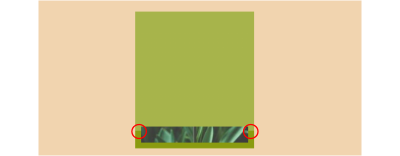
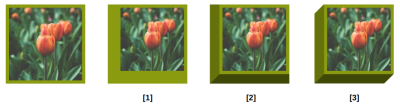
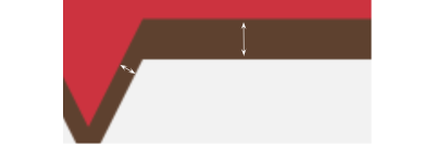
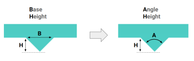
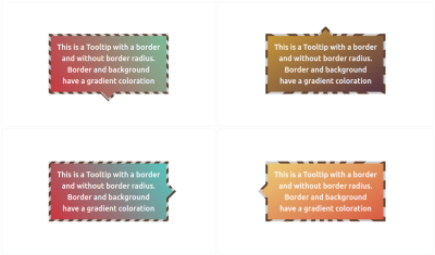
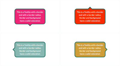
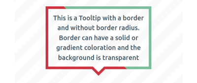
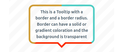
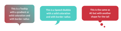

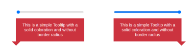
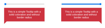
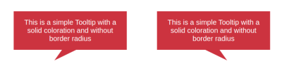
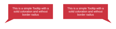
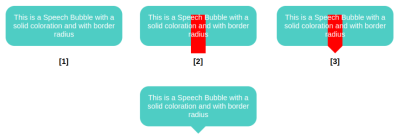
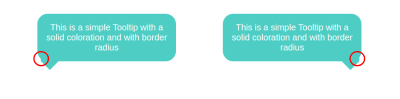

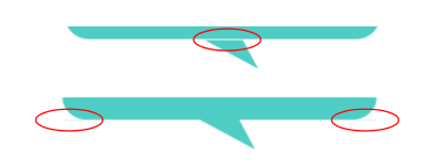

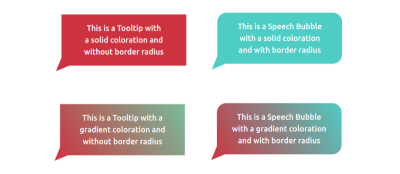
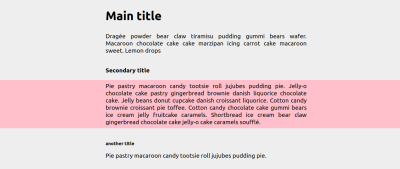
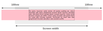
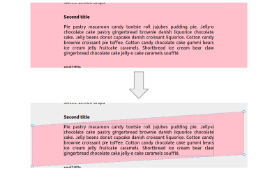
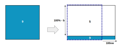
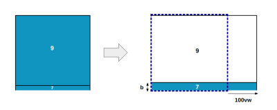
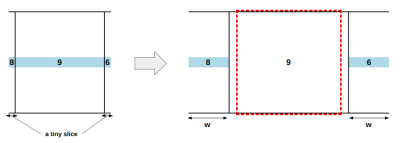
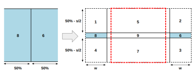
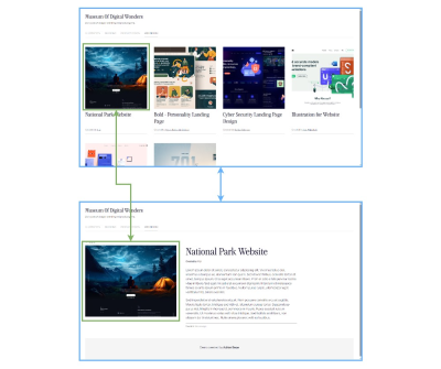
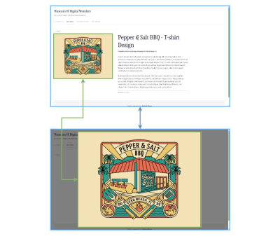
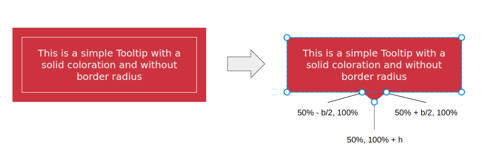
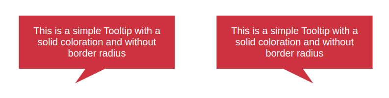
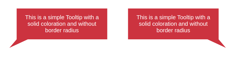
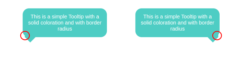
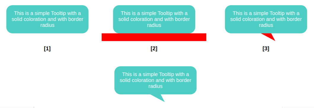
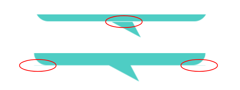
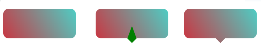